
SPOTIFY
How can we enhance the Spotify app to better serve podcast listeners and improve their overall experience? In this student project, I tackle this challenge by redesigning the Spotify app with a focus on accessibility and user-centric design.
OVERVIEW
Student project aimed at improving the Spotify app for podcast listeners by addressing hidden tools and enhancing accessibility.
MY ROLE
Strategy / Research / UX/UI
CHALLENGE
In this study, I identified and resolved interface pain points to ensure all users, regardless of their abilities, can seamlessly engage with the Spotify platform. This not only aligns with ethical considerations but also increases user engagement.
DESIGN THINKING
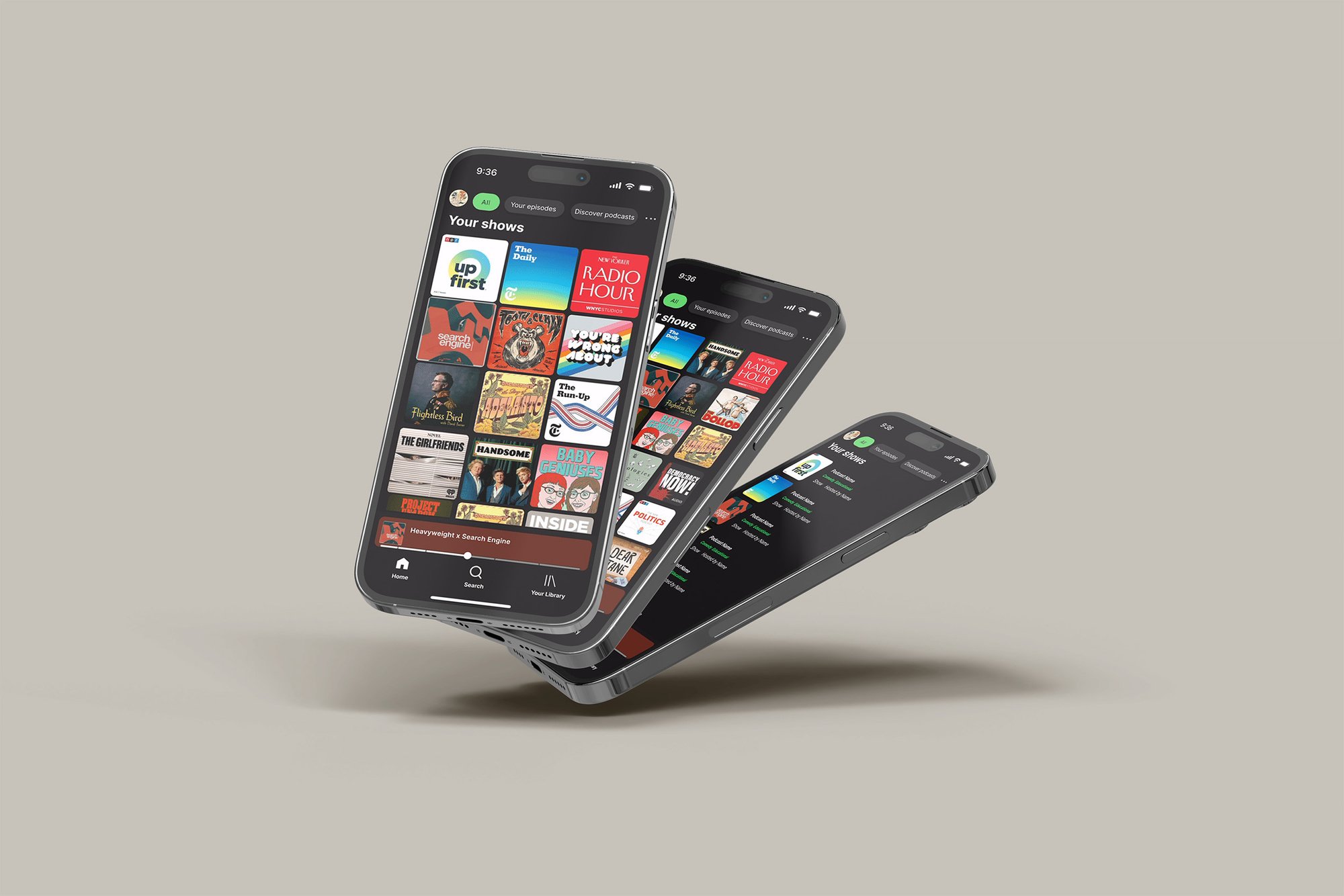
I researched Spotify's brand guidelines, brand thinking, and brand strategy and applied these to my proprietary Design Thinking methods to solve problems in a customer-backed way. The user interviews and customer-driven frameworks inspired me to redesign the home screen for an improved podcast listening experience, making hidden tools more accessible and navigation more comfortable for listeners.
GOAL
WHAT ISSUES AM I TRYING TO SOLVE?
Users are coming to Spotify and aren't happy with their podcast listening experience. They’re not finding the tools they need.
The main issues are:
Tools are hidden.
People are time poor, they don’t have time to search for the tools they need.
No accessibility features to customize the user experience how they need.

RESEARCH & DISCOVERY
HOW DID I SOLVE THESE PROBLEMS FOR USERS?
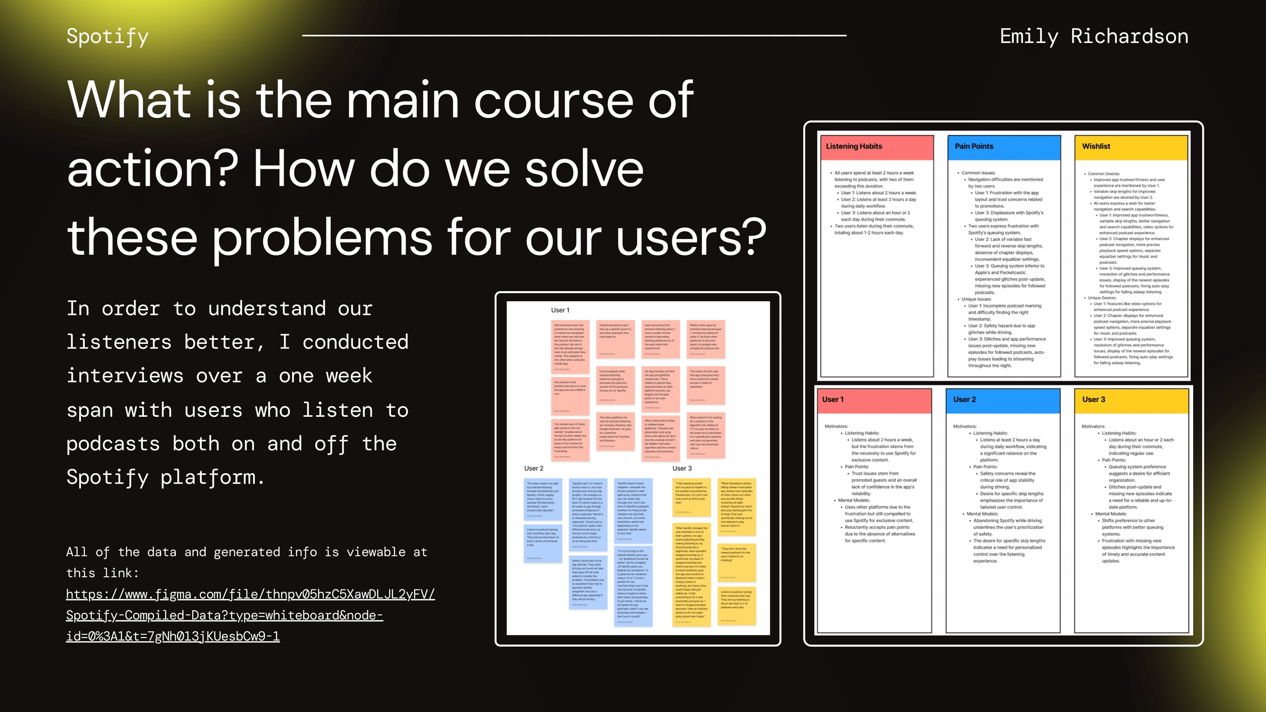
To better understand the podcast listening experience and identify areas for improvement, I conducted thorough research and discovery sessions.
Over the span of one week, I interviewed a diverse group of users who listen to podcasts both on and off the Spotify platform. These interviews provided valuable insights into their listening habits, pain points, and the features they wished to see in a podcast app.
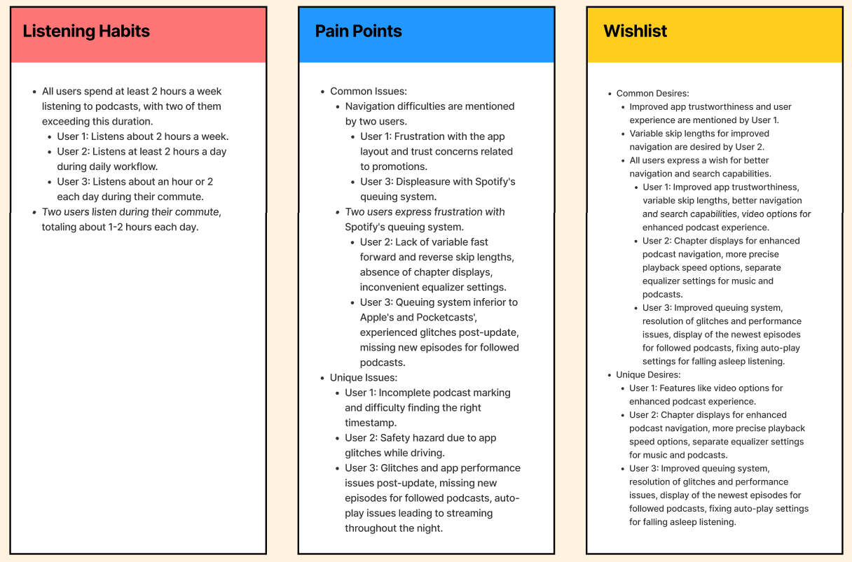
By analyzing the data collected from these sessions, I was able to identify common themes and specific user needs. This research phase was crucial in guiding the design process and ensuring that the solutions developed would effectively address the users' concerns and enhance their overall experience.
KEY TAKEAWAYS
From the generative interview sessions, it became clear that participants are not happy with the features Spotify currently offers for podcast listeners. The key takeaways indicate significant dissatisfaction with the app's usability and feature set, which has driven users to seek alternatives.
PARTICIPANT INTERVIEWS
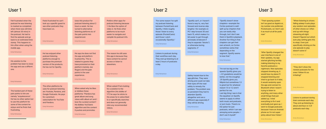
In conducting these interviews, I aimed to delve deep into the specific experiences and challenges faced by podcast listeners using the Spotify app.
I selected a range of participants to ensure a mix of demographics and experience with podcast listening to obtain a holistic view of user experiences.
Each interview began with broad questions about their podcast listening habits and gradually focused on their interactions with Spotify.
Key pain points emerged from these discussions, such as difficulties with the queuing system, hidden features, and the lack of accessibility options.
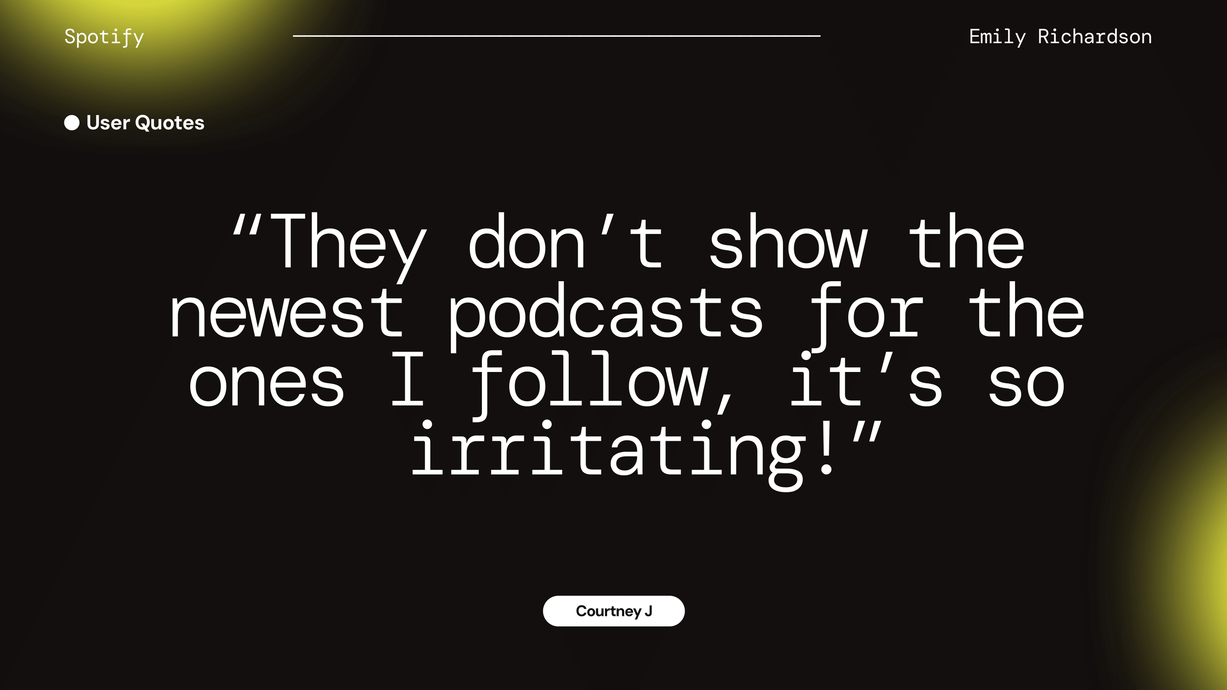
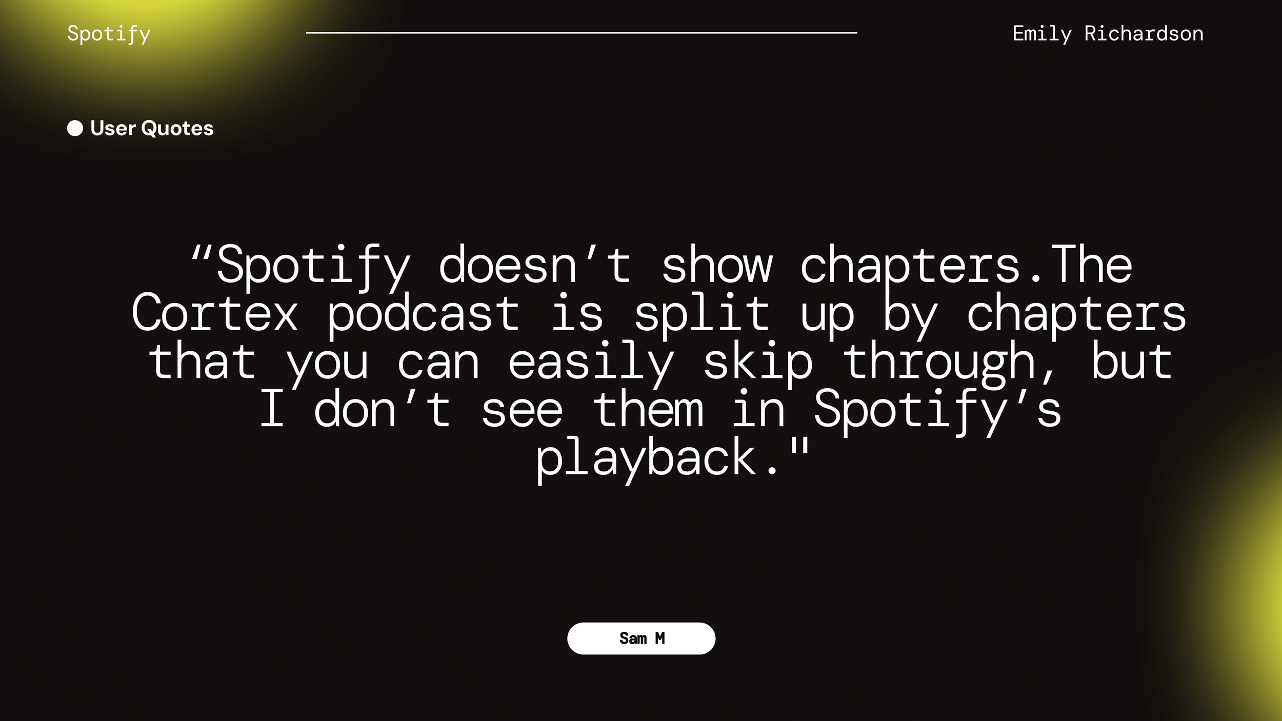
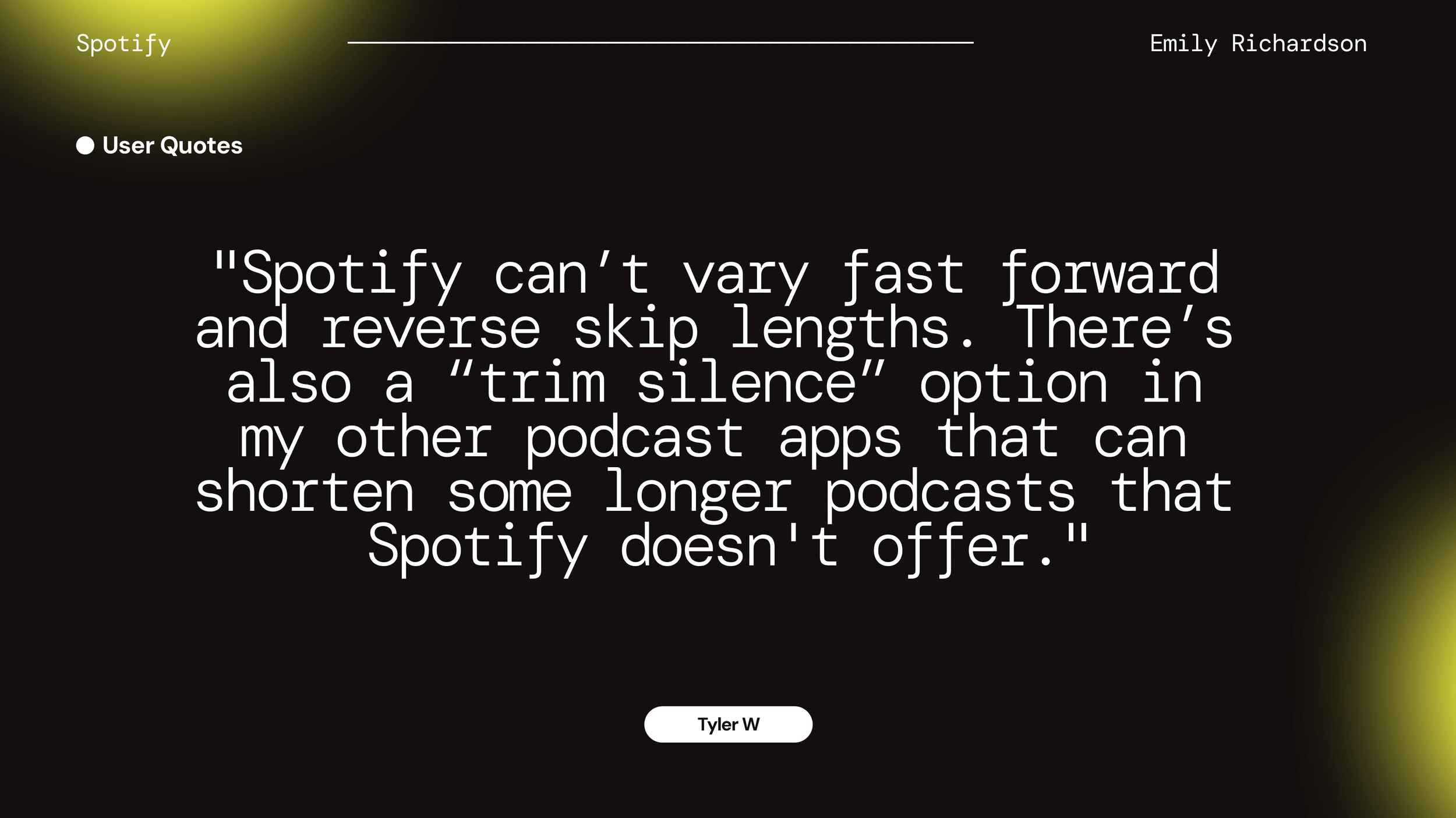
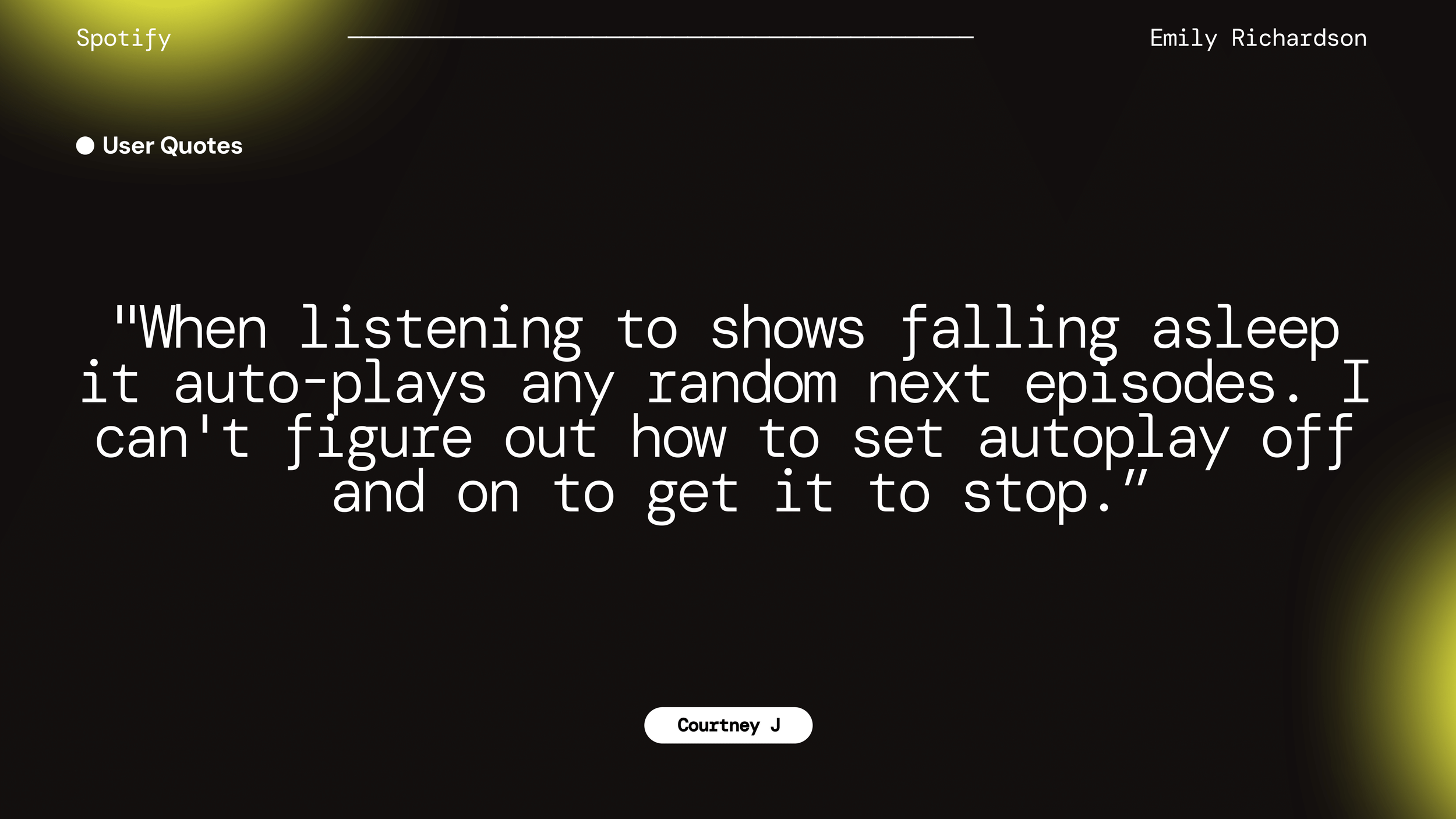
A look at highlighted quotes from the Participant Interviews.
These quotes highlighted specific areas where the app was falling short. By understanding these participants’ experiences, I was able to prioritize the most critical issues and incorporate user-driven solutions into the app redesign to ensure the final product would be user-friendly and aligned with the real needs of podcast listeners.
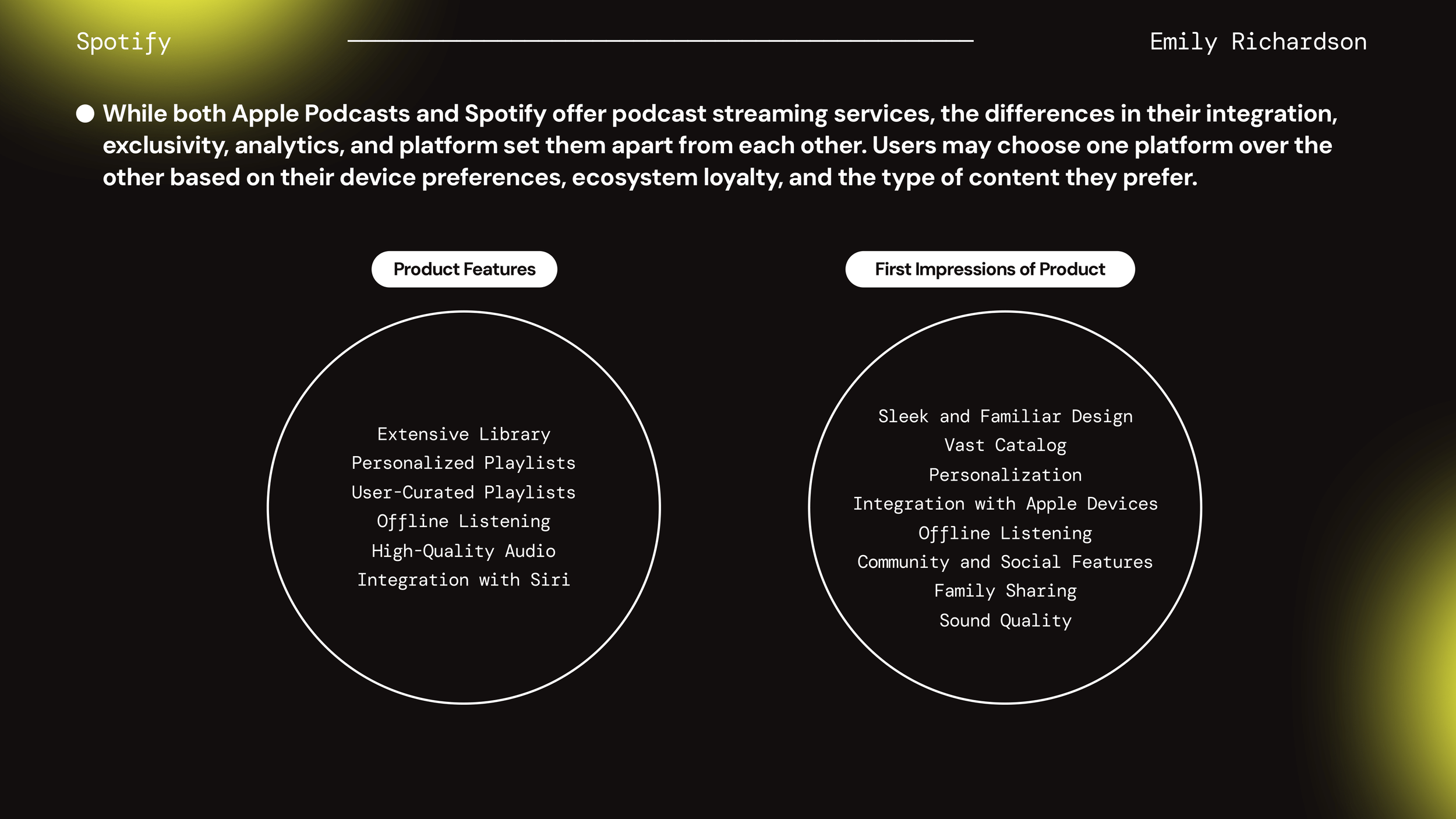
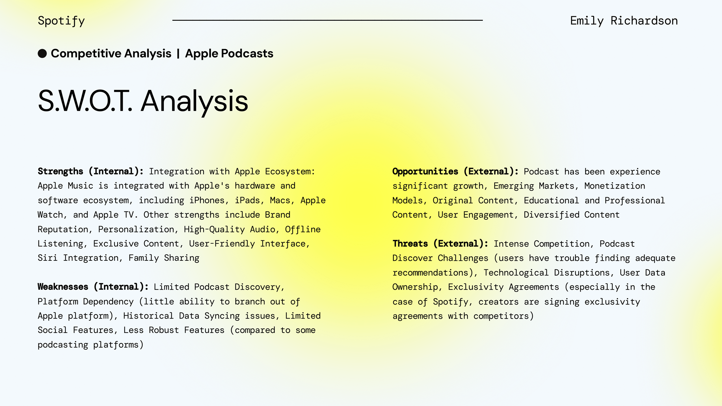
COMPETITOR RESEARCH & ANALYSIS
In order to thoroughly understand the competitive landscape, I conducted an in-depth analysis of competitors in the market. These competitors included Apple Podcasts, Amazon Music, Stitcher.
This research encompassed evaluating their value propositions, target audiences, brand positioning, and business models.
By comparing these insights with Spotify’s offerings, I identified critical gaps and opportunities for improvement, such as enhancing accessibility features and improving the visibility of podcast tools. This comprehensive competitor analysis provided a strategic foundation to develop features that not only address users' pain points but also position Spotify as a more competitive player in the podcast streaming market.


USER PERSONA: MEET JULIA
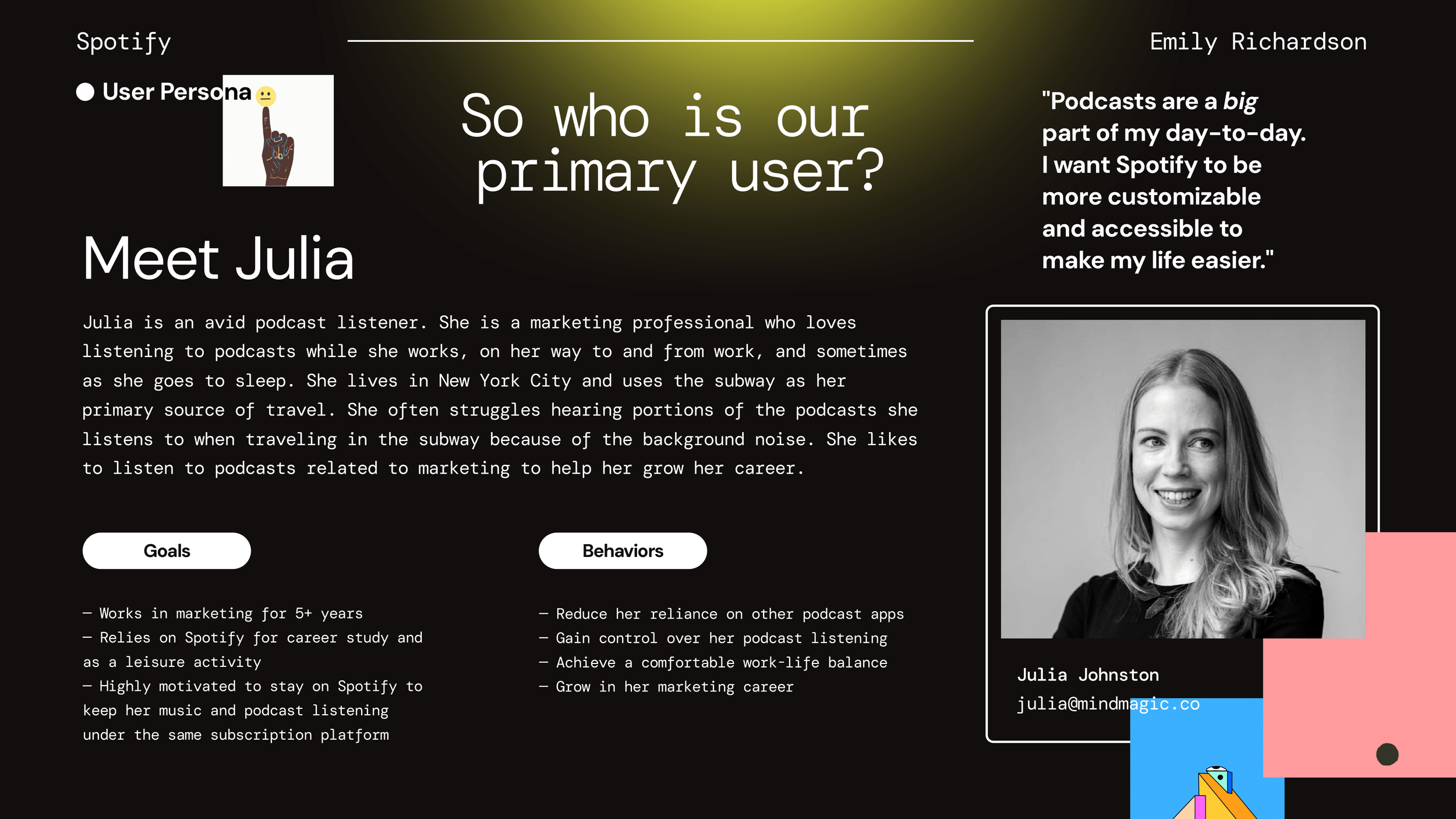
"Podcasts are a big part of my day-to-day. I want Spotify to be more customizable and accessible to make my life easier."
BACKGROUND
Julia is an avid podcast listener and a marketing professional who loves listening to podcasts while she works, commutes, and goes to sleep. She resides in New York City and relies on the subway as her primary mode of transportation. Julia often struggles to hear portions of the podcasts due to background noise during her subway rides. She enjoys listening to marketing-related podcasts to help her grow in her career.
GOALS
Works in marketing for over 5 years
Rely on Spotify for both career-related study and leisure activities
Stay on Spotify to keep her music and podcast listening under the same subscription platform
BEHAVIORS
Reduce reliance on other podcast apps
Gain control over her podcast listening experience
Achieve a comfortable work-life balance
Grow in her marketing career
SETUP AND CONCEPTS PHASE 1: WIREFRAMES
With a clear understanding of user needs and competitor insights, I began the wireframing process.
The initial phase involved sketching out concepts to develop a proof of concept, focusing on integrating the Wishlist Items identified during the Research & Discovery phase.
These Wishlist Items included chapter displays, video viewing, a separate equalizer for podcasts, precise skip forward and back settings, an easy-to-find autoplay toggle, and improved visibility of the newest podcasts first.

IDEATION: CONCEPT DEVELOPMENT AND REFINEMENT
Through iterative sketching and feedback, I developed low-fidelity wireframes that allowed for quick ideation and iteration.
These wireframes depicted various layout options, including large and small thumbnails and list formats, to cater to different user preferences.
Additionally, I incorporated a drag-and-drop navigation system for enhanced customization, added a notes and chapters section for more detailed podcast information, and implemented tools for easy access and navigation.
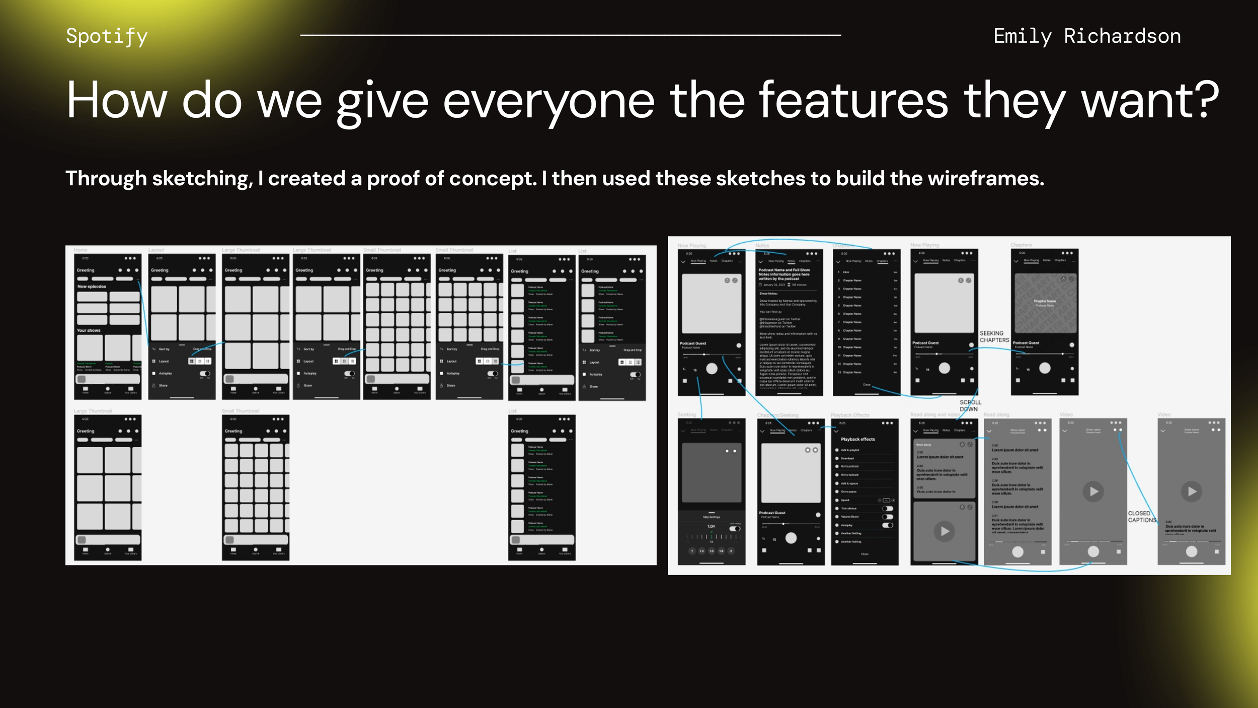
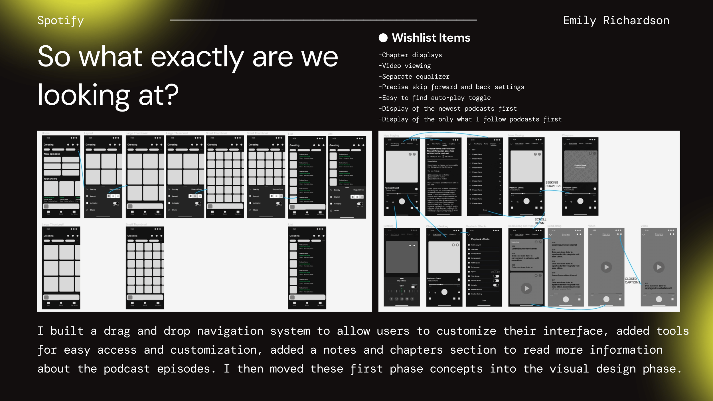
This structured approach ensured that the wireframes addressed both user pain points and the desired features, setting a solid foundation for the subsequent visual design phase. The detailed sketches and wireframes served as a roadmap to guide the prototype development, ensuring alignment with user needs and business goals.
The sketches and wireframes served as a roadmap to guide the prototype development, ensuring alignment with user needs and business goals.
By moving these first-phase concepts into the visual design phase, I ensured the final product would be functional and aesthetically pleasing while meeting the users' requirements and enhancing the overall experience.
VISUAL DESIGN AND FINAL TESTS
In the Visual Design and Final Tests phase, I transitioned the low-fidelity wireframes into high-fidelity designs, incorporating Spotify's branding elements to create a cohesive and visually appealing user interface.
The visual design phase focused on refining the aesthetics, ensuring that the interface was not only functional but also engaging and intuitive for users. I paid close attention to typography, color schemes, and iconography to maintain brand consistency and enhance usability.

FINAL SCREENS
Once the high-fidelity prototypes were developed, I conducted thorough usability testing to gather feedback on the visual and interactive aspects of the app. This testing phase involved users navigating through the app, performing various tasks, and providing insights on their experiences.
Based on their feedback, I made final adjustments to the design, ensuring that all elements were optimized for a seamless user experience. The culmination of this phase resulted in a polished, user-centered design that addressed the identified pain points and incorporated the desired features, ready for implementation.
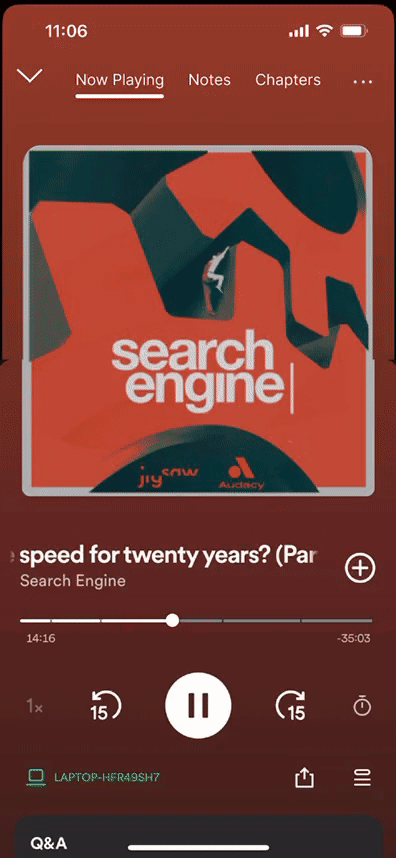
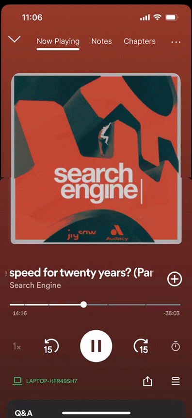
View of the Notes & Chapters update.
View of the Read Along & Video Viewing update.
View of the Drag & Drop update.
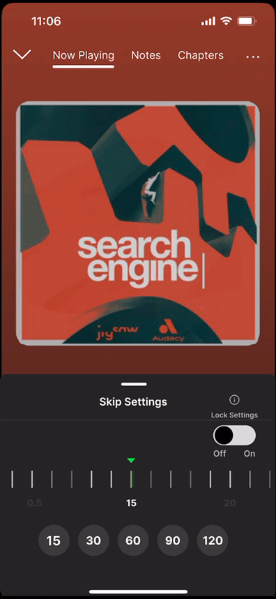
View of the Seeking Settings update.
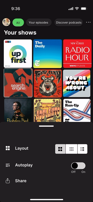
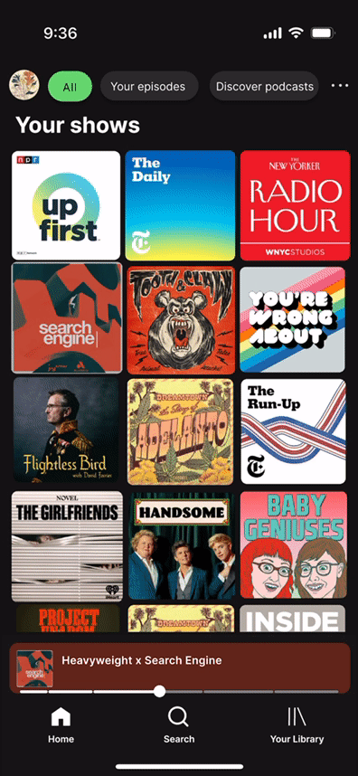
View of the Homepage Layout update.
View of the Settings Panel update.
RESULTS
By focusing on accessibility and customization, I successfully integrated much-needed features like a customizable home page with a drag & drop setting, chapter and note displays, video viewing options, adaptive seeking settings, separate equalizer and other needed settings, and an easier-to-use auto-play toggle.
Through in-depth user interviews and usability testing, I addressed key pain points. The iterative process from low-fidelity wireframes to polished visual designs ensured I stayed true to user needs while staying true to Spotify’s brand guidelines. Competitor analysis also played a crucial role, helping me add features that set Spotify apart in the podcast app space.
The final prototype, after rigorous testing and refining, showed a notable decrease in user frustration and an uptick in app engagement. This project underscored the power of user-centered design in solving real problems and creating a product that exceeds expectations.
REFLECTION
Working on the Spotify Podcast App project as a design student in a UX program was an incredible learning experience. It really drove home the importance of user-centered design and how crucial it is to keep iterating based on user feedback. Conducting user interviews and usability tests provided eye-opening insights that shaped the final product in ways I hadn't initially envisioned.
The project also taught me a lot about the value of competitor analysis. Seeing what other apps were doing well (and not so well) helped me identify areas where we could really stand out. Balancing user needs with business goals, while keeping the design true to Spotify’s brand, was challenging but incredibly rewarding.
This project reinforced the power of collaboration and the need to be flexible and adaptable in design. It was a key part of my UX education, giving me hands-on experience and a deeper appreciation for the entire design process. It showed me that great design isn’t just about looking good—it’s about creating solutions that truly improve the user experience.