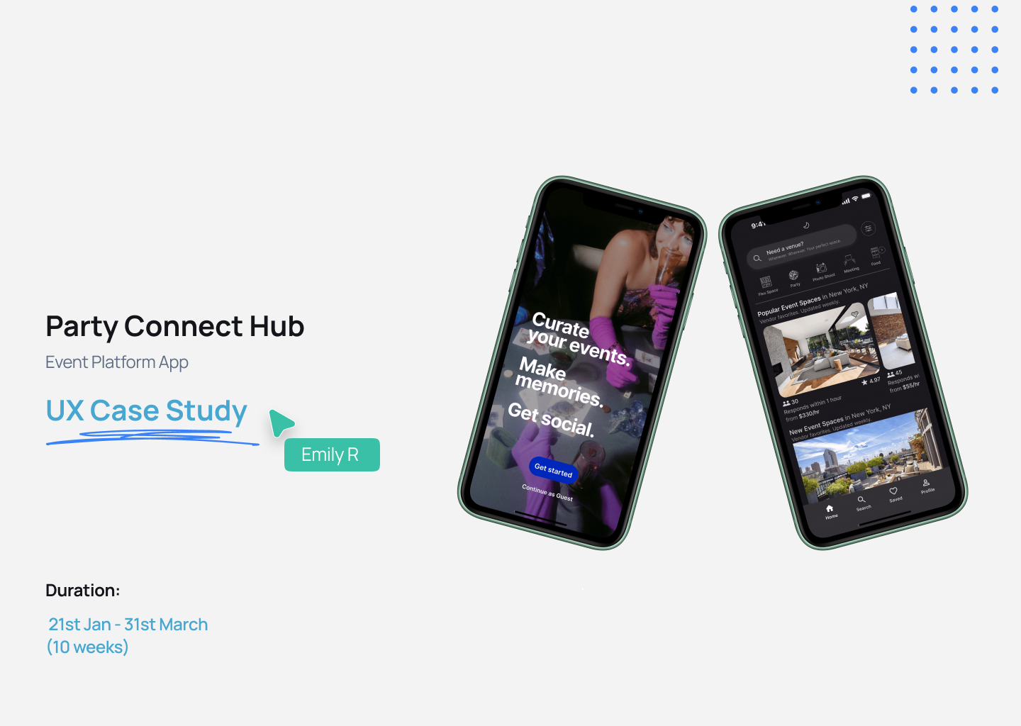
PARTY CONNECT HUB (PCH)
A streamlined event-discovery platform connecting organizers and attendees.
Areas
UX research, IA, interaction design, UI, prototyping
Platform
Web + Mobile
Duration
6 weeks
Overview
Party Connect Hub is a platform aimed at simplifying how people find, join, and engage with local events. Our goal was to eliminate the friction users face when browsing event apps, while giving organizers better tools for event profiles, communication, and post-event engagement.
This case study walks through our approach from framing the problem and mapping the user experience to designing a clean, responsive interface.
The Team
3 designers
My Role
Lead UX Designer — Defined project scope and success metrics, facilitated team collaboration, and led all design efforts from research through high-fidelity prototyping.
Conducted competitive analysis, identified user pain points, and mapped user flows.
Produced information architecture, low-fi wireframes, clickable prototypes, and high-fi designs.
Presented findings and design rationale to peers for critique and iteration.
The Challenge
Existing event-discovery apps overwhelm users with irrelevant events, poor filtering, and scattered communication tools. Organizers struggle to engage attendees or follow up after events, resulting in lost opportunities for connection.
Pain Points
Event discovery friction: Users waste time scrolling through irrelevant events and confusing filters
Low-quality event profiles: Important details like date, location, and cost are buried or inconsistent
Lack of communication tools: Organizers rely on external apps or manual messaging to follow up with attendees
Design Goals
Simplify Discovery: Intuitive filters and categories to easily surface relevant events faster.
Clarify Event Profiles: Key details and RSVP actions above the fold.
Enable Engagement: Integrated messaging to foster pre- and post-event interaction.
Success Criteria
Reduced number of steps required to RSVP
Improved scanability of event details on both desktop and mobile
Increased organizer-to-attendee interaction through integrated messaging
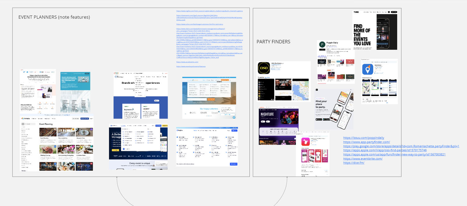
Research & Discovery
Competitive Analysis
I and my team reviewed four leading event-discovery platforms — Meetup, Eventbrite, Facebook Events, and Dice — to identify industry patterns and usability gaps.
Key Findings
Strengths:
Robust search and filtering systems (Meetup)
Personalized event recommendations (Eventbrite)
Clean, simple RSVP flows (Dice)
Gaps:
Disjointed messaging tools that push users off-platform
Overwhelming default event feeds with low relevance
Inconsistent event information layouts, leading to confusion
These insights shaped our early requirements: prioritize clean navigation, improve information hierarchy, and integrate messaging within the platform.
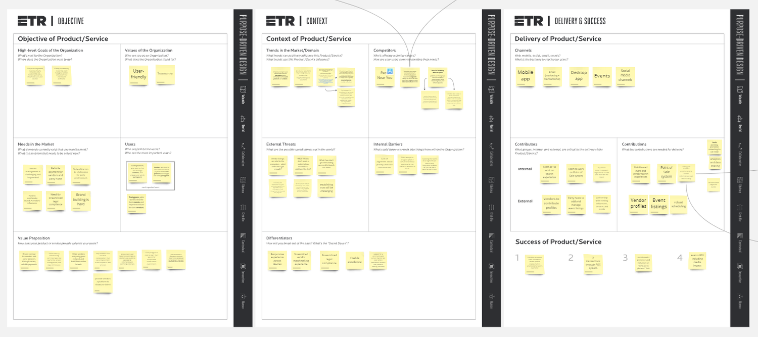
Architecture & Requirements
To lay the foundation, I and my team mapped the end-to-end journeys for planners, attendees, and vendors. This revealed the most critical interactions and informed our feature set.
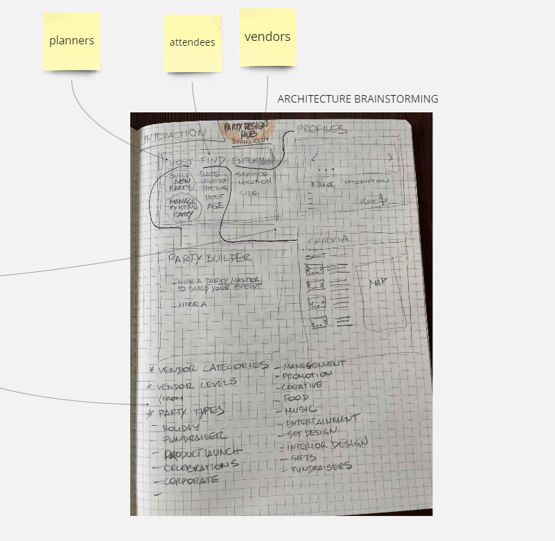
Key Outputs:
Core interactions for each user type (event creation, discovery, vendor messaging)
Prioritized vendor categories & event types for filtering
Success metrics (active users, vendor inquiries, events created)


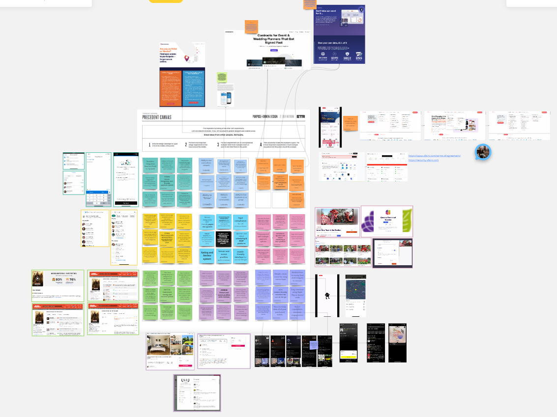
Ideation & Wireframes
Using FigJam and Figma, we sketched multiple approaches to event discovery, profile layouts, and vendor browsing flows.
Sketches: Early iterations explored persistent filtering, tabbed navigation, and RSVP micro-flows.
Wireframes: We converged on a card-based layout and produced clickable wireframes to validate hierarchy and flow.
Iteration: Peer critiques revealed filter overload; we reduced filter options by 50% and simplified the event profile layout to surface date, time, and RSVP at the top.
Testing & Iteration
We ran quick hallway tests and peer critiques on a clickable Figma wireframe.
What we tested: discovery (search/filters), event profile comprehension/RSVP, messaging entry points.
Findings → changes:
Filter overload → reduced to top four + “More filters” drawer
Essentials buried → moved date/time/location/price + sticky RSVP above the fold
Messaging unclear → persistent “Message organizer” on profile and post-RSVP
Wayfinding gaps → breadcrumbs + persistent “Discover / My Events” nav

Key Improvements
Pain Points
Endless scrolling through irrelevant events
Important details buried on event pages
Fragmented organizer–attendee communication
Hard to compare vendors
New users unsure how to start
Design Solution
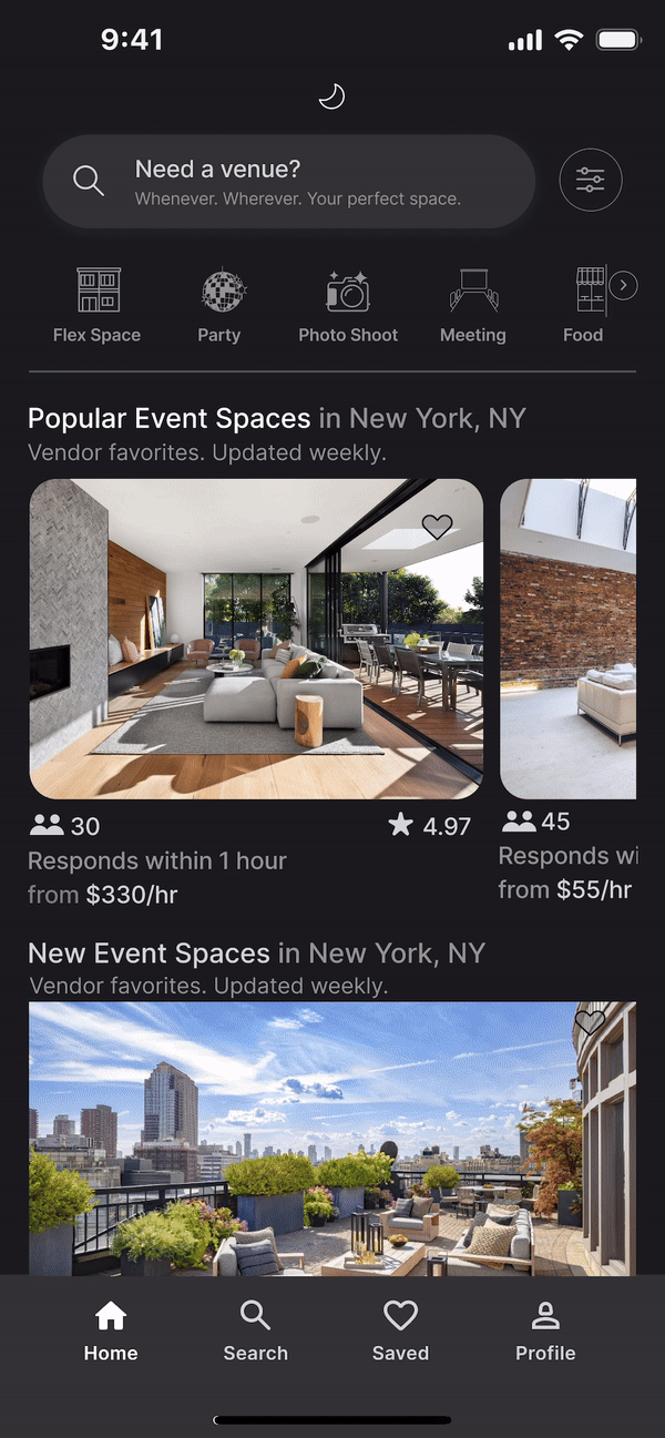
Card grid + top filter bar (with “More filters” drawer)
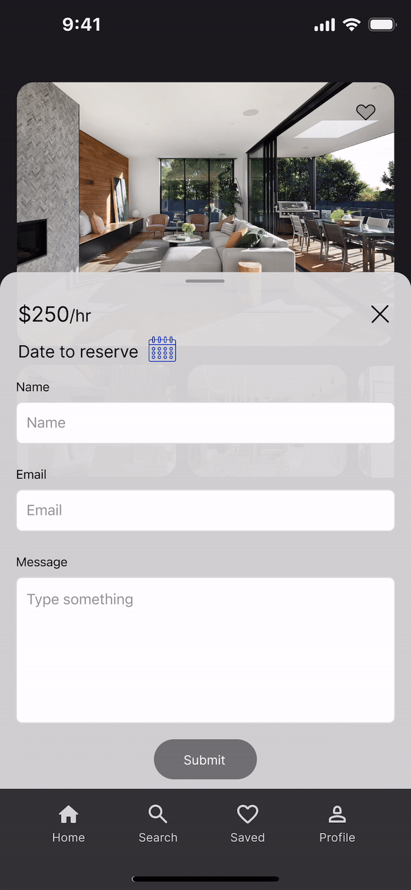
Essentials (date, time, location, price) + sticky RSVP above the fold
In-app messaging from event profile and post-RSVP confirmation
Image-first vendor gallery with swipe/keyboard nav + saved shortlist
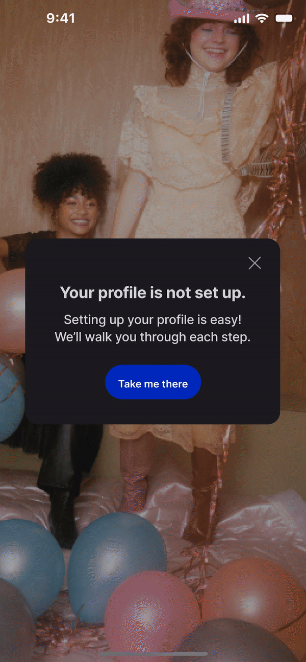
Streamlined sign-up with clear first task (“Create an event” or “Browse nearby”)
Expected Impact
Faster relevance; fewer scrolls to first viable event
Higher scanability; quicker RSVP decisions
Fewer drop-offs to external apps; more on-platform engagement
Easier vendor evaluation; more vendor inquiries per event
Smoother onboarding; earlier “aha” moment
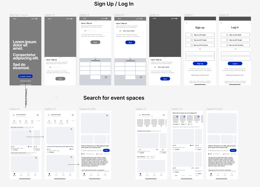
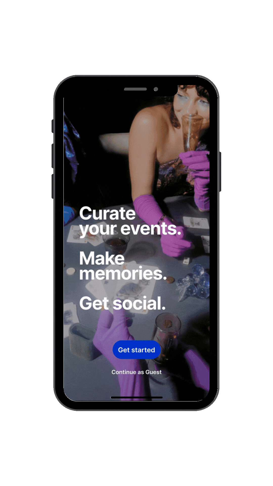
Sign-Up / Onboarding (GIF)
Clear fork: Create an event vs Browse events
Progress indicator + single-column forms reduce friction
Create Event Profile (GIF)
Essentials first (title, date/time, location, capacity, price)
Sticky RSVP preview shows how attendees will see the card
Message an Organizer (GIF)
Persistent “Message organizer” from profile and post-RSVP
Lightweight modal keeps users in-flow; no external apps
View Vendor Images (GIF)
Image-first gallery with quick compare + save to shortlist
Vendor contact CTA pinned for easy outreach
Outcomes & Next Steps
Prototype-level outcomes
RSVP path shortened (fewer screens and decision points)
Higher comprehension of event details on first glance
More organizer–attendee messages initiated in-app
What we’ll measure next
Time-to-first-RSVP from landing on Discover
% of users who message organizers before/after RSVP
Vendor inquiries per event and shortlist saves
Next steps
Run 8–10 moderated usability tests (desktop + mobile)
Iterate on filter relevance and recommendation logic
Expand organizer tools (post-event follow-ups, templates)
Reflection
Prioritizing essentials (filters, event basics, and messaging) delivered the biggest usability gains. Keeping communication in-platform reframes PCH as more than a listing service, and more as an engagement tool for organizers and attendees. With usability testing and analytics, we’ll refine the discovery model and validate where the design delivers the most impact.