
SPOTIFY FOR PODCASTS
Enhancing navigation, accessibility, and customization for podcast listeners.
Areas
UX research, Competitor analysis, Wireframing, UI design, Prototyping
Platform
Mobile (iOS / Android)
Duration
5 weeks
Overview
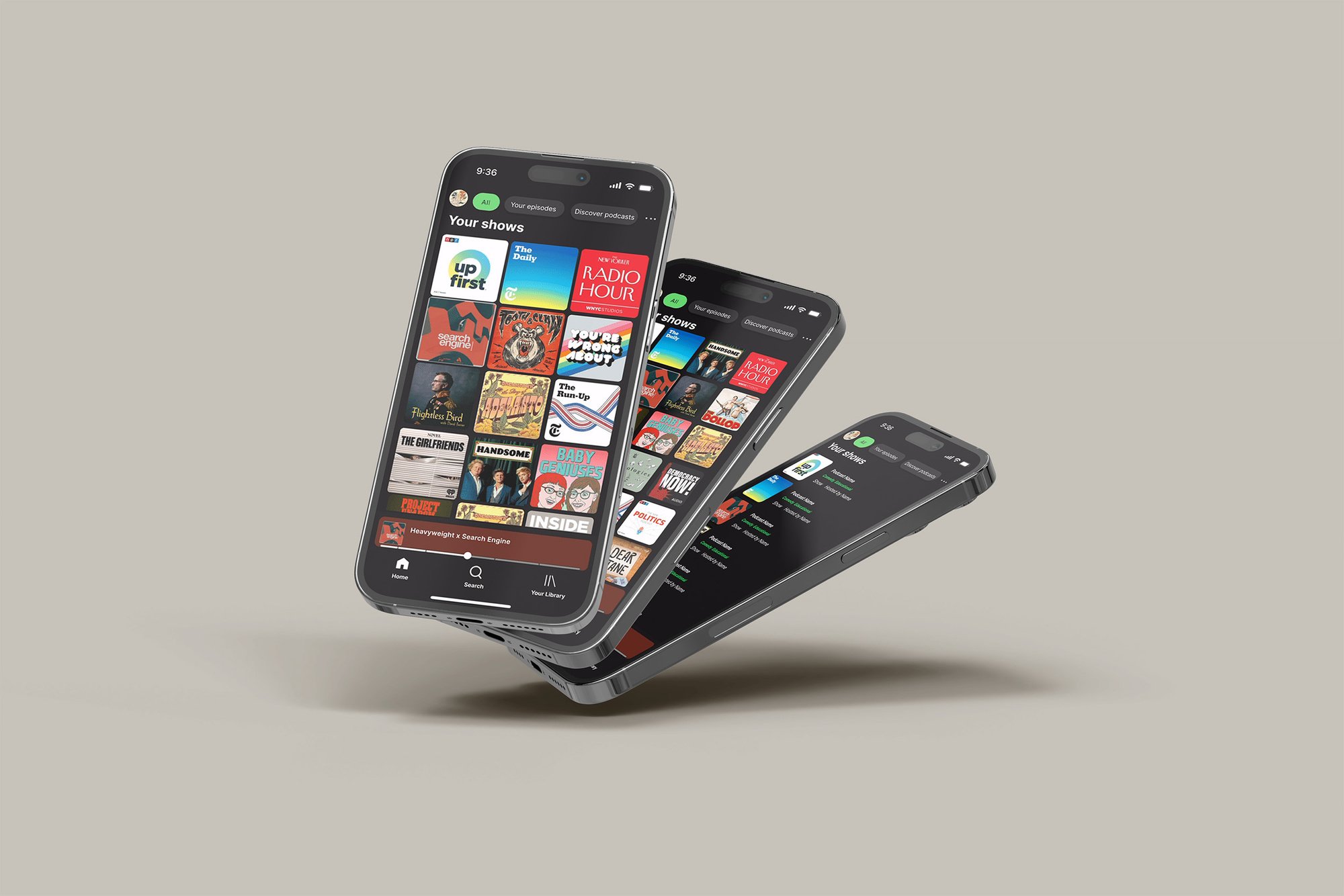
Spotify is one of the most popular audio platforms in the world — but its podcast experience lacked visibility of key tools, meaningful customization, and accessibility options. This project focused on rethinking the podcast experience to surface essential features like queue and chapters, add personalization, and improve accessibility. Over five weeks, I conducted user interviews, competitor research, and usability testing, then designed a prototype introducing new features such as Notes & Chapters, a customizable homepage, and a podcast-specific equalizer.
The Team
Lead UX designer.
Feedback was gathered through peer critiques and usability testing to simulate a real product design review process.
My Role
Lead UX Designer — responsible for research, concept development, and final prototype.
Conducted interviews with podcast listeners to uncover pain points
Synthesized findings into personas and user flows
Produced wireframes, interactive prototypes, and high-fidelity designs
Ran usability tests and iterated based on user feedback
The Challenge
Podcast listeners on Spotify struggled with hidden features, limited customization, and poor accessibility. Commuters, in particular, found navigation frustrating and abandoned the app mid-journey.
Design Goals
Surface key tools like queue, chapters, and autoplay toggle
Add accessibility and customization options (equalizer, transcripts, notes)
Reduce taps and friction for core podcast tasks
Create a smoother, more inclusive experience for diverse listening contexts

Approach
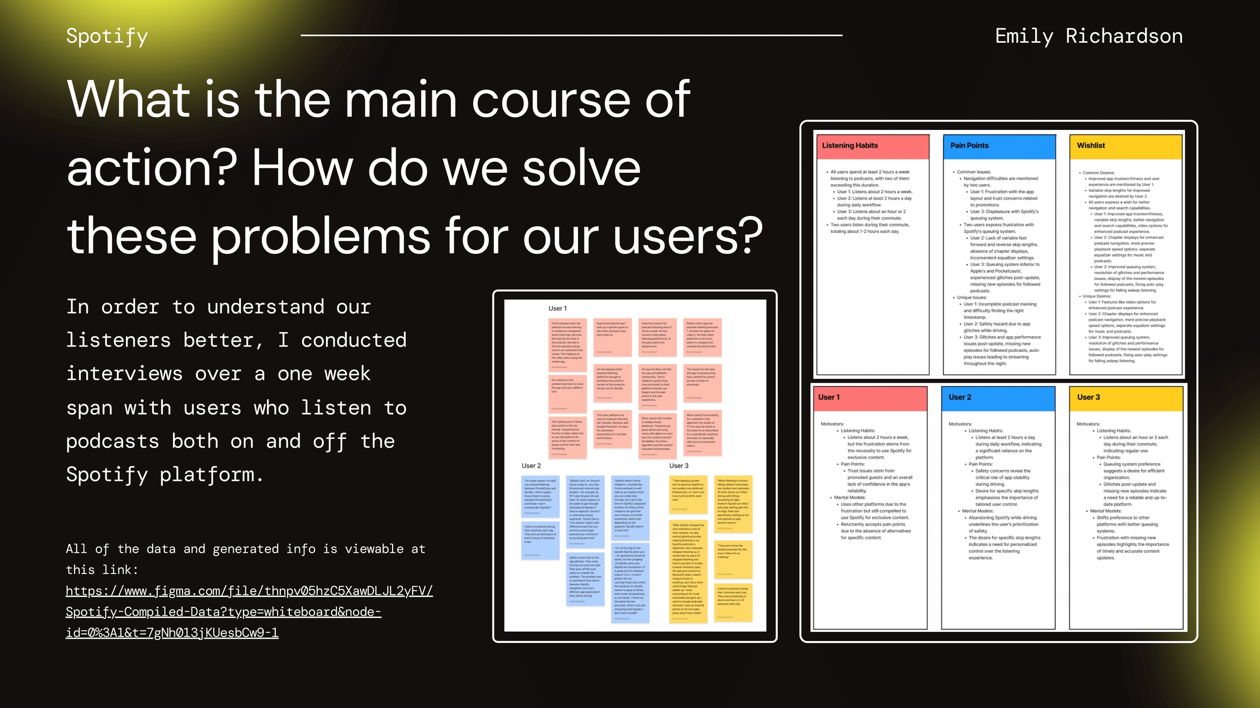
To deeply understand how listeners interact with Spotify’s podcast tools (and where frustrations lie), I interviewed 8 frequent podcast users: 4 Spotify listeners, 4 users of competing apps (Overcast, Pocket Casts, Apple Podcasts).
Participants included:
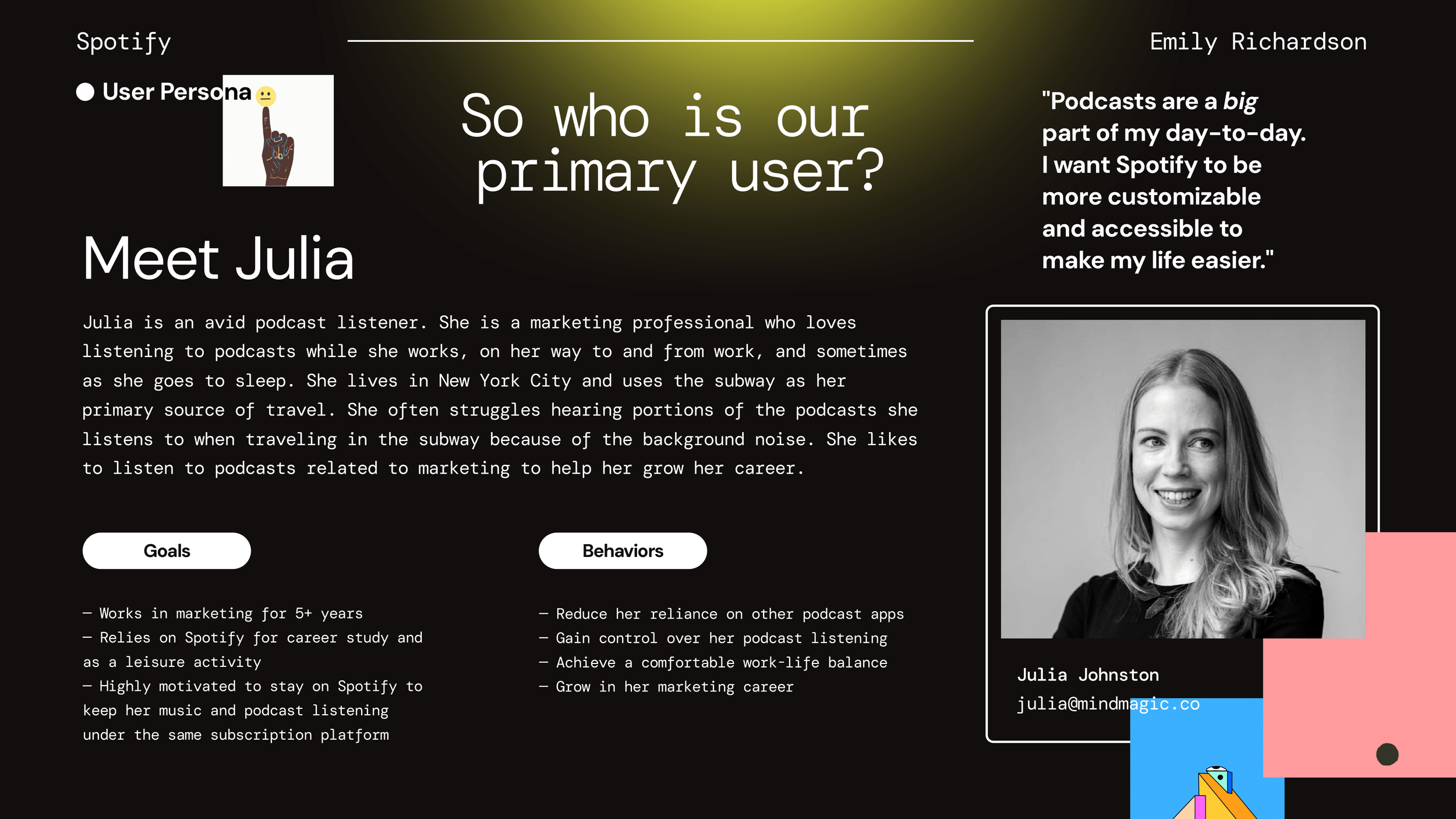
Julia, marketing professional commuting daily (Spotify user) — values hands-free controls, clear chapter skipping
Courtney, student who listens mostly at home — wants detailed notes and transcripts
Tyler, parent listening while multitasking — frustrated by small tap targets and buried settings.
Sam, visually impaired listener using screen-reader features — noted missing alt-texts, low contrast
Research & Discovery
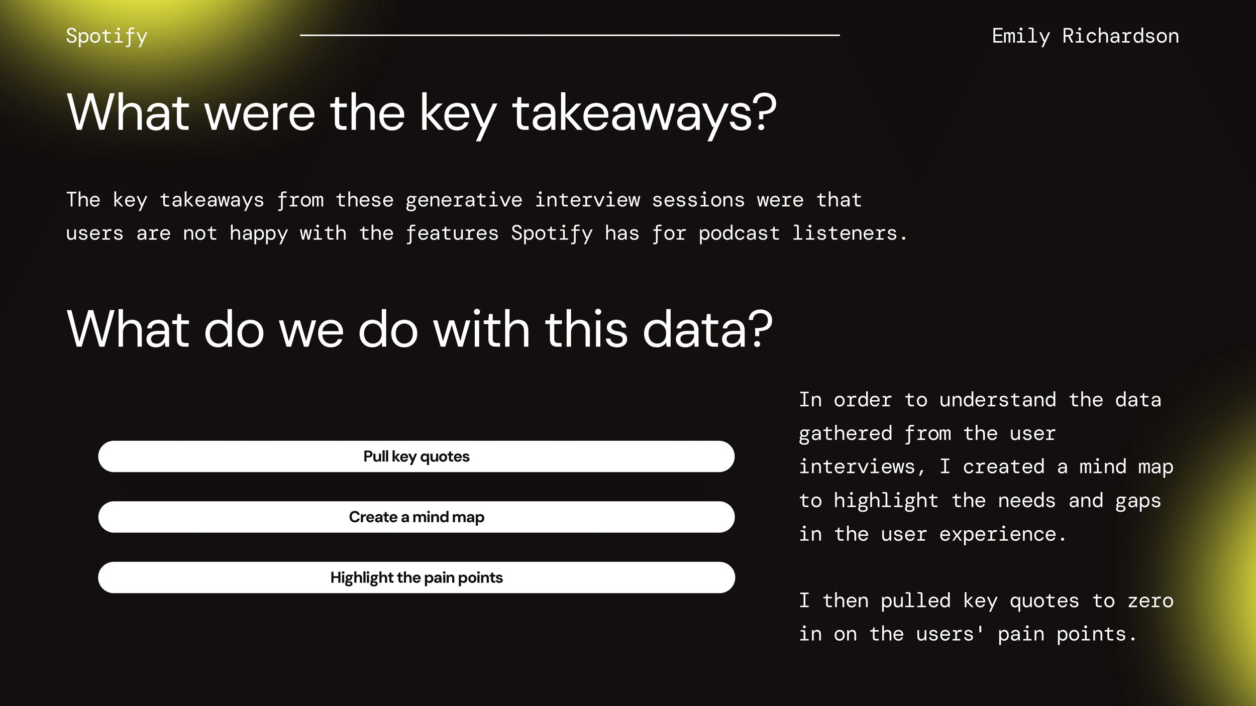
Key Insights
Users couldn’t find their queued episodes quickly — queue was 3-4 taps deep, with low visibility
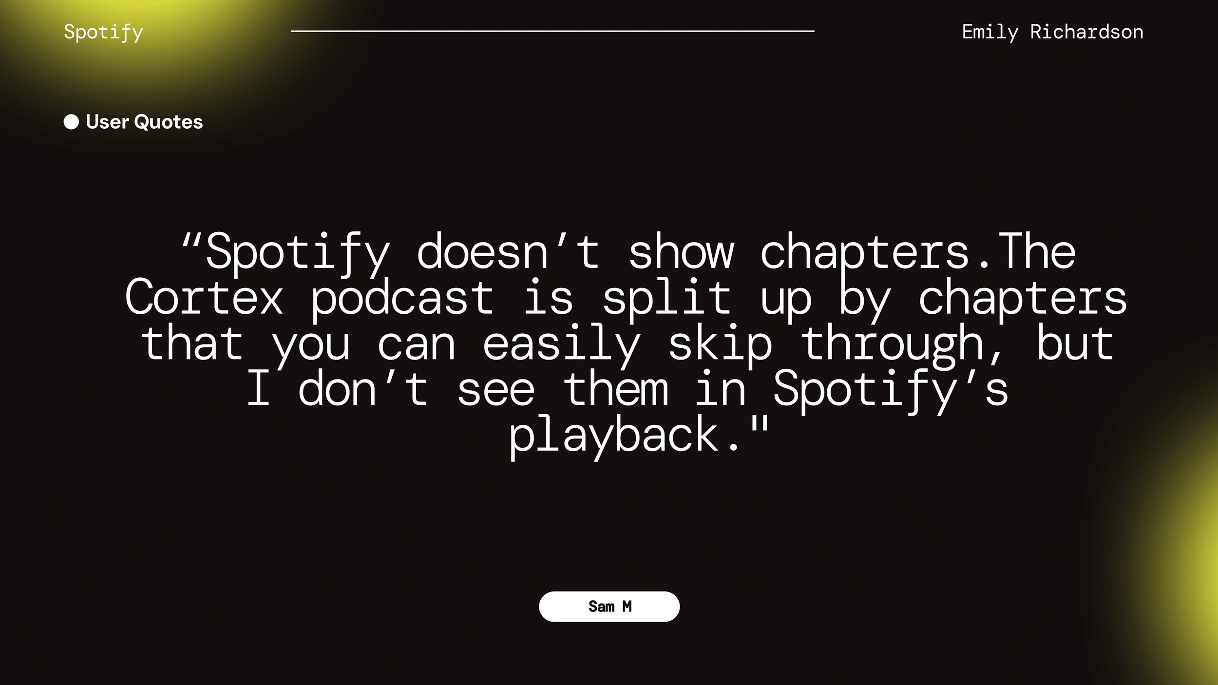
Chapter navigation was largely absent; for long podcasts, listeners had no control over jumping between sections
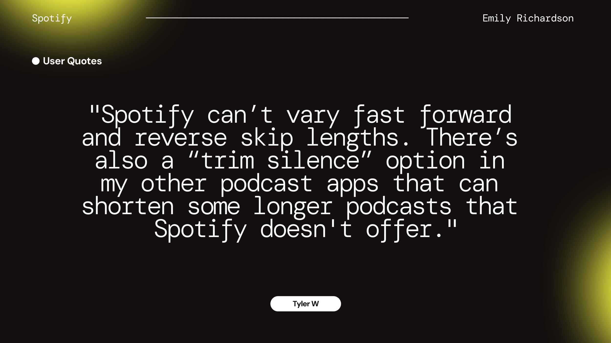
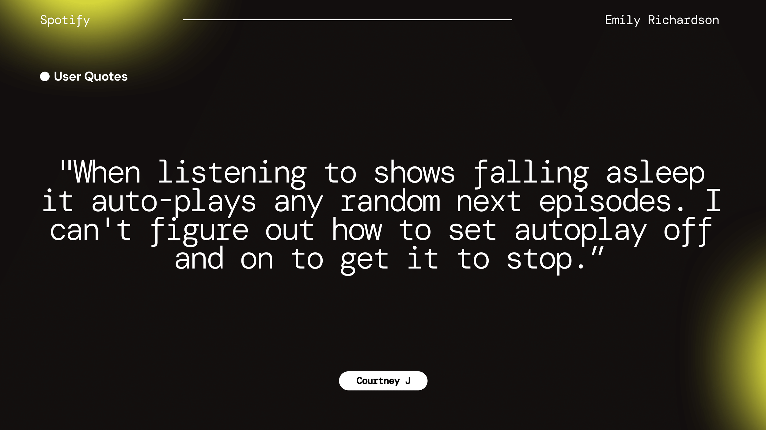
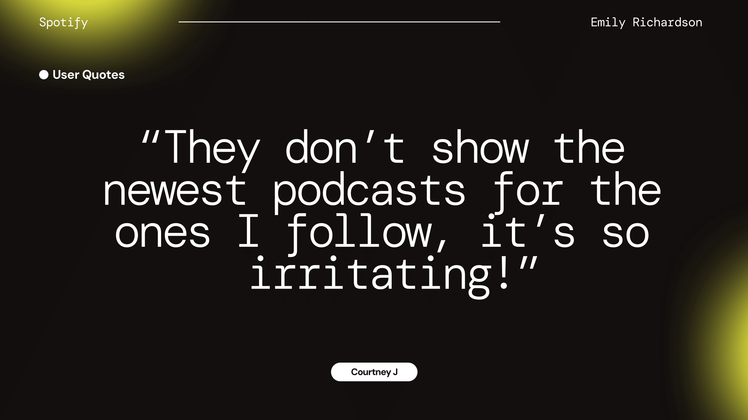
Settings and customization features (skip length, skip silence, equalizer) were hidden or not obvious
Accessibility issues: too small tap targets, text contrast low in some UI elements, lack of visual feedback when controls selected
Commuters especially disliked hitting wrong UI elements while in transit
Persona — Julia
A marketing professional who listens daily on NYC subway commutes.
Goals: Keep music & podcasts on one platform, bookmark chapters/notes, control playback
Frustrations: Queue buried, no chapters, no autoplay toggle
Opportunities: Streamlined navigation, customizable controls, better episode visibility
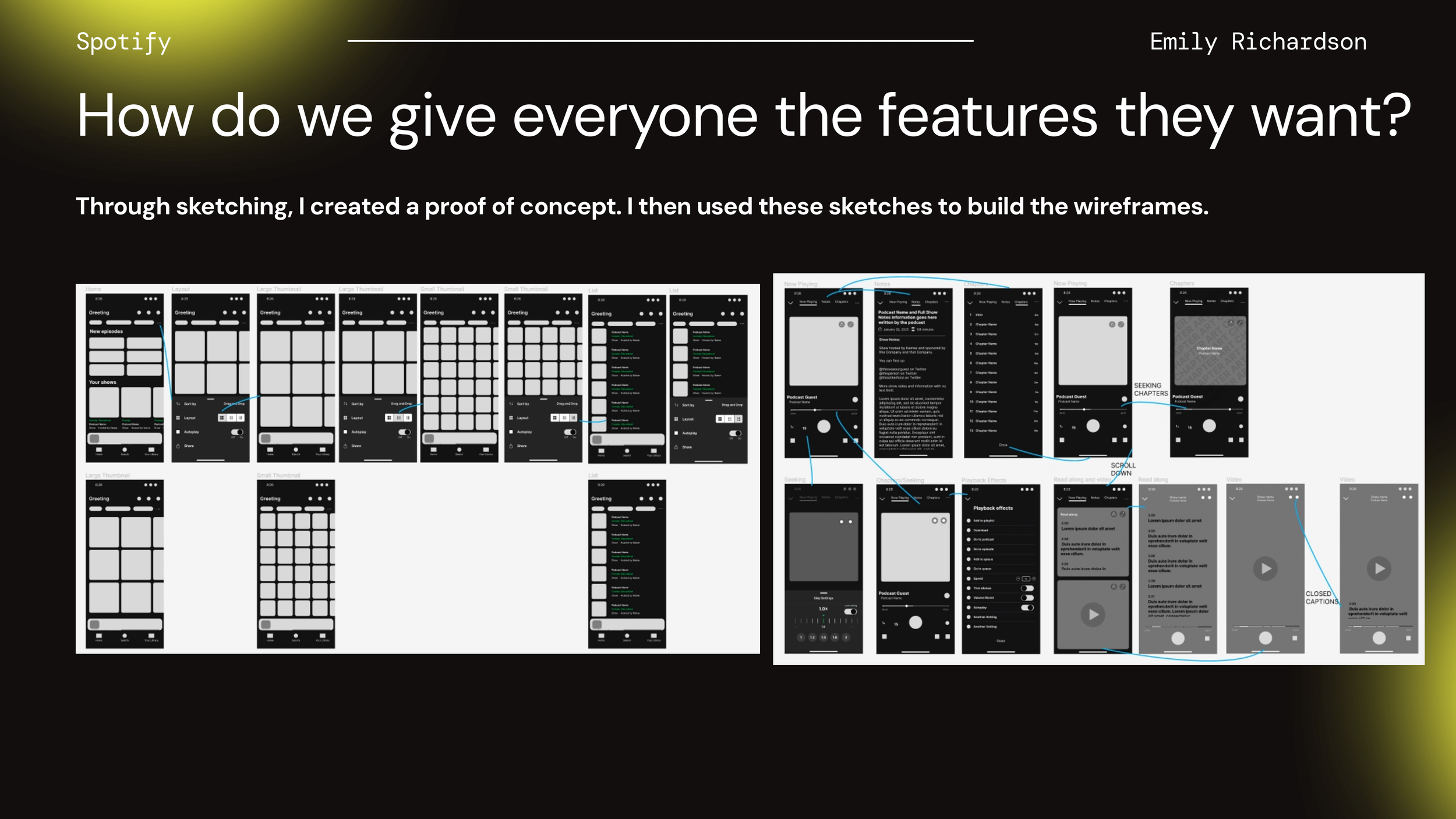
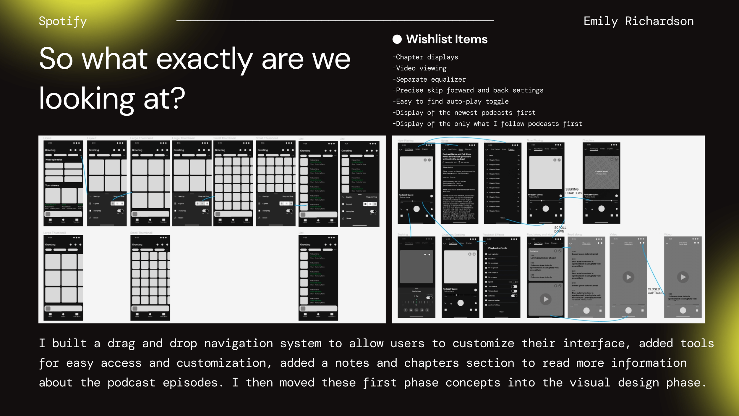
Ideation & Wireframes
I translated findings into sketches and low-fi wireframes to validate structure and control placement.
Chapters & Notes: Added tabs to the Now Playing screen for quick navigation and bookmarking
Navigation: Moved Queue to primary nav; added larger, customizable skip buttons
Customization: Introduced a podcast-specific equalizer and adjustable skip intervals
Testing & Iteration
I built a clickable Figma prototype and conducted 6 moderated usability tests with participants drawn from the research pool (commuters, home listeners). Key tasks included:
Findings → Changes
Accessing the “Queue” from main screen and adding/removing episodes
Jumping between chapters within a long podcast episode
Changing settings: skip interval, autoplay toggle, enabling equalizer
Finding notes/transcripts for previously listened episodes
Key Improvements
Pain Point
Hidden Queue
Missing Chapters
Buried Settings
Small Skip Buttons
Expected Impact
Fewer taps, faster playback
Easier episode navigation
Less friction, faster setup
Better commuting usability
Design Solution
Moved queue to bottom nav
Added persistent Notes & Chapters tab
Surfaced Autoplay + EQ in top-level panel
Added customizable skip intervals + larger tap targets
Final Designs
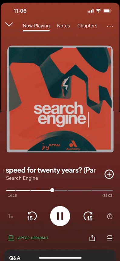
Notes & Chapters — Bookmark moments, add notes, and jump between sections.
Video Playback — Seamlessly switch between audio and video episodes.
Customizable Home — Drag and drop sections to tailor your podcast dashboard.
Seeking & Autoplay — Adjustable skip lengths and a clearly surfaced autoplay toggle.
Podcast EQ — Spoken-word equalizer for noisy environments.
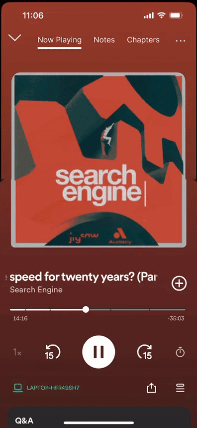
Notes & Chapters tab added to the player for fast navigation and bookmarking.
Seamless audio↔video switch while maintaining controls.
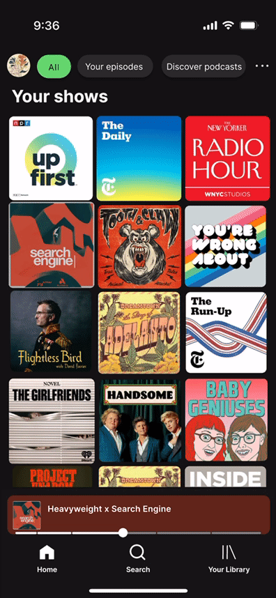
Personalize your home with drag-and-drop sections
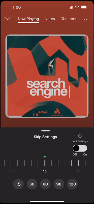
Adjustable skip intervals; large tap targets for in-transit use.
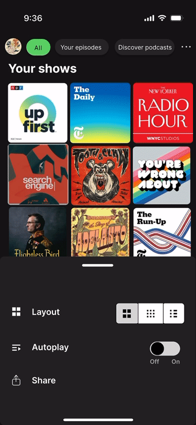
Homepage Layout update
Autoplay and Podcast EQ surfaced in a top-level panel.
Outcomes & Reflection
Prototype-Level Outcomes
Taps to access Queue reduced from 4 → 2 on average
All 6 test users rated navigation “much easier” or “very easy” post-redesign vs pre-redesign
Users expressed strong positive feedback for Notes & Chapters — described them as “very helpful” for organized listening
Time to perform common tasks (like adjusting skip length) dropped by ~30% (estimated from prototype flow).
Next Steps
Run a broader test with frequent podcast listeners and commuters
Track engagement with Notes/Chapters and home customization
Explore transcripts and “trim silence” options; expand accessibility checks (labels, VoiceOver)
Reflection
Designing for real listening contexts (commuting, in-bed, multitasking) pushed me to think carefully about visibility, tap targets, and minimizing taps. Surfacing core tools first (queue, chapters, autoplay) delivered meaningful improvements in usability.
In future versions, I’d like to:
Expand testing to include users with disabilities (visual, motor, hearing) to ensure accessibility across edge cases
Prototype and measure transcript features and “trim silence” for long episodes
Explore adaptive UI based on listening context (e.g. larger controls when in transit, different themes for low-light or night)
Collect quantitative metrics via analytics if this were productized: task completion rate, drop-off points, daily usage of new features