
BROOKLYN BOTANIC GARDEN (BBG)
A modern, accessible redesign of the BBG website to serve a diverse audience of local visitors, students, tourists, and plant enthusiasts.
Areas
UX research, heuristic analysis, interaction design, UI, accessibility
Platform
Responsive Web
Duration
4 weeks

My Role
UX/UI Designer — conducted a heuristic evaluation of the original site, identified usability and accessibility issues, and led the redesign of navigation, layout, and content hierarchy.
Applied Nielsen’s 10 usability heuristics to assess site effectiveness
Proposed and validated a streamlined navigation system
Created wireframes and redesigned key sections with accessibility in mind
Overview
The Brooklyn Botanic Garden website redesign aimed to improve navigation, modernize the visual design, and make key visitor information easier to find. The project focused on creating a clean, accessible experience for a diverse audience — from first-time visitors looking for hours and tickets, to members exploring events and programs.
This case study outlines my approach: conducting a heuristic evaluation, mapping content priorities, and redesigning key sections to better serve BBG’s users.
The Team
Solo designer with peer critique.
Collaborated with a small group for heuristic review feedback and design critique sessions to ensure solutions were user-centered.
The Challenge
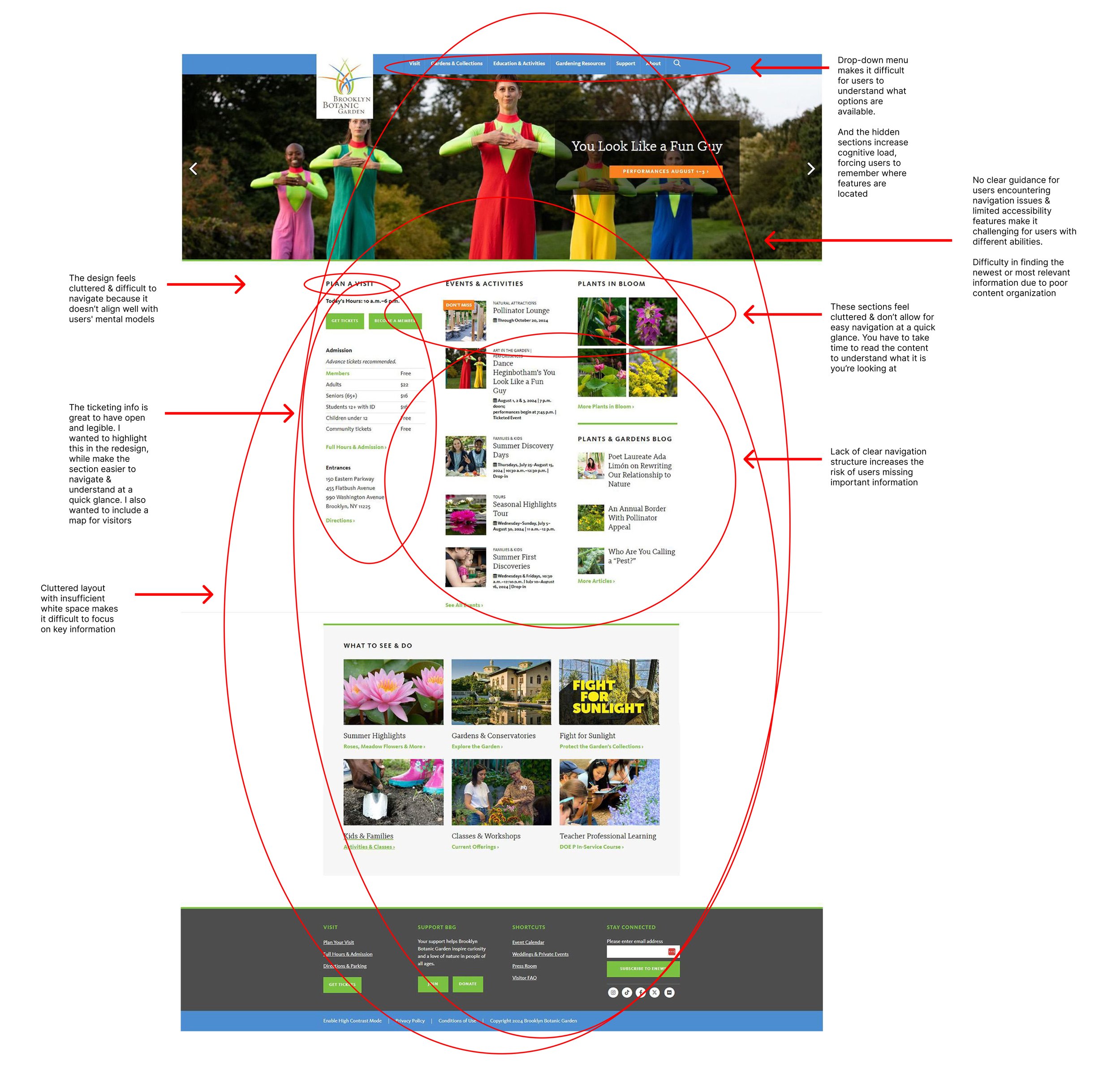
The original Brooklyn Botanic Garden website made it unnecessarily difficult for visitors to find critical information like hours, tickets, and events.
Pain Points
Clunky, confusing dropdown navigation
Crowded homepage with poor hierarchy
Hidden visiting information
Clunky carousel with weak CTAs
Accessibility gaps (contrast, missing alt text)
Underutilized blog section
Disorganized footer
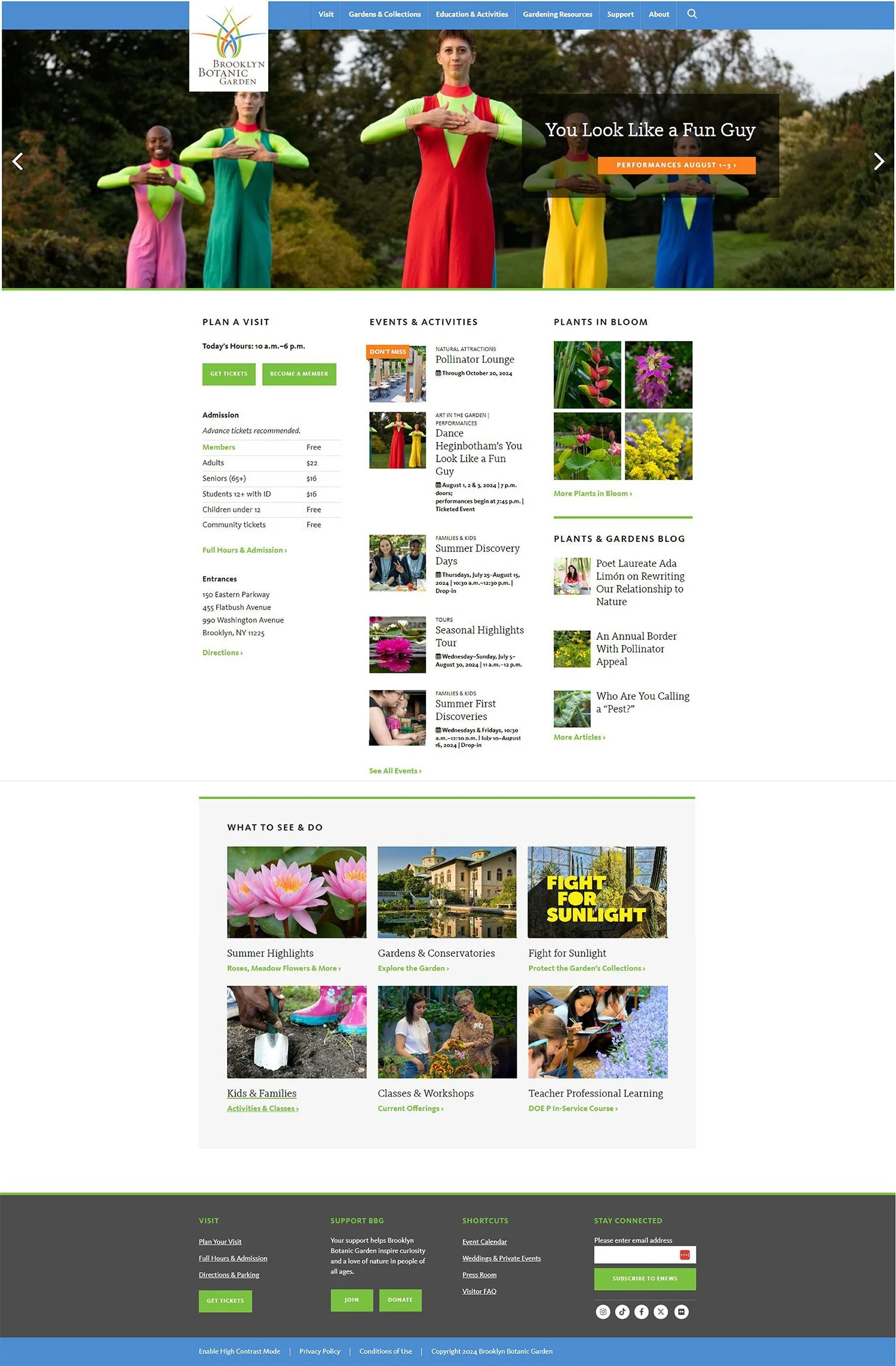
Design Goals
Replaced with a persistent sidebar navigation that is always visible and labeled clearly
Introduced a clean, grid-based layout with clear white space and grouped content
Surfaced hours, ticket prices, and map link in hero section
Redesigned carousel with large arrows and clear “Learn More” button
Added alt text, improved contrast, and clear focus states
Redesigned “Plants & Gardens Blog” with larger images and simplified layout
Streamlined footer into clear sections
Expected Impact
Reduced clicks to key pages and improved wayfinding
Faster scanning and reduced cognitive load
Visitors see essential info immediately
Increased click-through to featured events
Improved inclusivity and compliance with WCAG AA
Encourages exploration and increases dwell time
Easier access to secondary resources
Research & Discovery
Heuristic Audit
I evaluated the existing site using Nielsen’s 10 usability heuristics. Key issues included inconsistent navigation, overcrowded content sections, ambiguous CTAs, and lack of mobile responsiveness.
User Interviews
To understand key user needs, I conducted 4 interviews with potential users:
Tourists unfamiliar with BBG (seeking event schedules & ticket info)
Local visitors / gardeners wanting plant information & garden maps
Students or educators seeking learning resources or programs
People with visual or mobility impairments needing accessible features
Key Insights
Many website visitors struggled to find event / program schedules; often the information was buried in sub-menus
The image carousels or sliders didn’t clearly convey calls to action; people didn’t know which parts were clickable
Users with accessibility concerns noted poor contrast in text overlays, small clickable areas, missing alt-text
Impact on Design
These findings drove the redesign approach: streamline navigation, declutter the interface, and prioritize accessibility from the start.
Ideation & Wireframes
I translated research findings into a new site structure and layout concepts, focusing on solving the key navigation and hierarchy issues uncovered in the heuristic analysis
Navigation: Explored sidebar vs. mega-menu options and validated with quick tree-tests to ensure users could find hours, tickets, and events faster
Layout: Shifted to a grid-based layout to introduce hierarchy, breathing room, and logical grouping of content
Content Priority: Mapped visitor needs so that hours, ticket prices, and garden map links would always appear at the top of the homepage
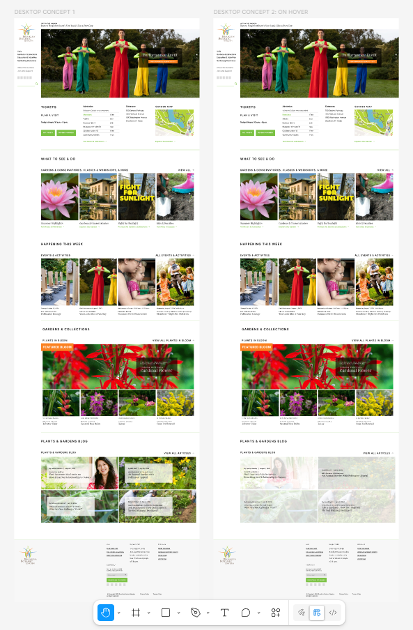
Key Improvements
Original
Cluttered layout, buried hours/tickets, confusing navigation.
Redesign
Modern grid layout, sidebar navigation, surfaced essentials.

Pain points
Confusing header navigation
Overcrowded homepage
Hidden visiting info
Clunky carousel
Poor accessibility
Design solution
Replaced dropdown with a persistent sidebar navigation
Introduced grid-based layout with clear white space
Moved hours, ticket prices, and map link to hero section
Rebuilt carousel with large arrows + clear call-to-action
Added alt text, improved color contrast, clarified CTAs
Results & Impact
Navigation clicks reduced: prototype testing revealed that many users were able to locate events/ticket info in 2 clicks instead of 4
Engagement improved: redesigned hero section & blog layout saw higher dwell time in usability prototype – users more inclined to scroll into content
Accessibility wins: all main action buttons now meet WCAG AA contrast standards; images now have descriptive alt attributes; design tested on mobile + desktop
Prioritizing content hierarchy (what visitors need first) made largest usability improvement
Early user feedback (mockups) exposed ambiguous navigation labels; changing labels early avoided bigger revisions
Would improve further by running moderated usability tests with people with disabilities, testing multi-device interactions, and refining the site map with real analytics data
Reflection