AUSTEN & ALCOTT
SCOPE
Brand Identity
TOOLS
Illustrator / Photoshop
OVERVIEW
Overview
Brand concept for Austen & Alcott Public Library.
The brand identity reflects A&A’s commitment to fostering knowledge, curiosity, and community engagement. They strive to be more than just a repository of books; they are a hub of learning, discovery, and connection. The brand identity is designed to convey the library’s values and to create a welcoming and inclusive environment for all.
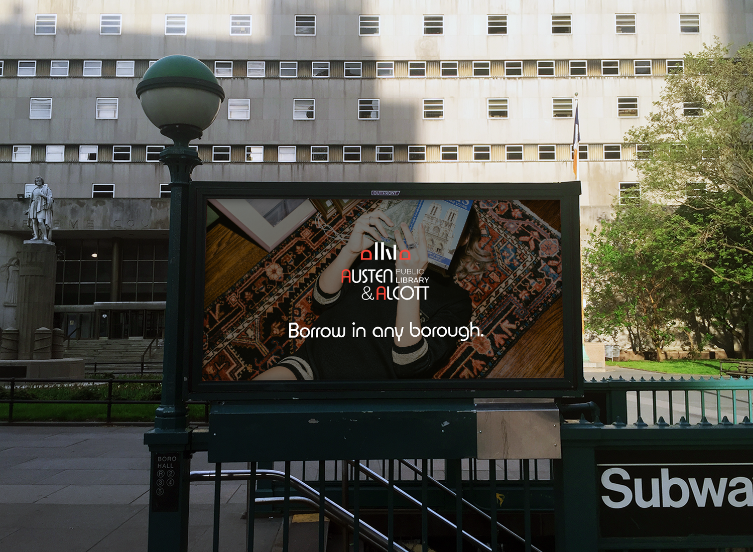
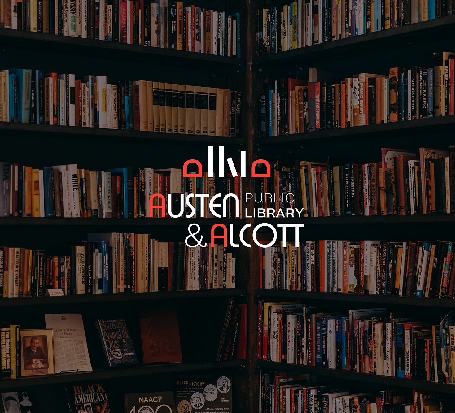
Logo:
The letters "A" are styled to resemble bookends, with a bold color and modern shape to signify a sense of solidity. Positioned between the bookend "A"s are books, symbolizing the rich literary heritage and diverse collection offered by Austen & Alcott. The logo captures the essence of a well-stocked library, inviting book lovers to explore the literary treasures that await within its shelves.
Typography:
The primary font is clean, sans-serif, and easy to read, ensuring accessibility for all visitors. The font style strikes a balance between professionalism and approachability, reflecting the library’s commitment to providing a comfortable and accessible space for learning and exploration.
Color Palette:
The color palette consists of warm and inviting tones. The dominant color is a deep blue, representing trust, stability, and knowledge. This is complemented by an accent of vibrant red-orange, symbolizing growth, innovation, and a zest for learning. This color evokes a sense of inspiration, creativity, and intellectual stimulation.
Brand Voice:
The brand voice is informative, friendly, and encouraging. Austen & Alcott aim to inspire curiosity and a love for reading through their communications. They use clear and concise language, making information accessible to all audiences. Their tone is inclusive and welcoming, inviting individuals of all ages, backgrounds, and abilities to explore and engage with their library's offerings.

CHALLENGE
Brand concept for Austen & Alcott Public Library.
The brand identity reflects A&A’s commitment to fostering knowledge, curiosity, and community engagement. They strive to be more than just a repository of books; they are a hub of learning, discovery, and connection. The brand identity is designed to convey the library’s values and to create a welcoming and inclusive environment for all.
Logo:
The letters "A" are styled to resemble bookends, with a bold color and modern shape to signify a sense of solidity. Positioned between the bookend "A"s are books, symbolizing the rich literary heritage and diverse collection offered by Austen & Alcott. The logo captures the essence of a well-stocked library, inviting book lovers to explore the literary treasures that await within its shelves.
Typography:
The primary font is clean, sans-serif, and easy to read, ensuring accessibility for all visitors. The font style strikes a balance between professionalism and approachability, reflecting the library’s commitment to providing a comfortable and accessible space for learning and exploration.
Color Palette:
The color palette consists of warm and inviting tones. The dominant color is a deep blue, representing trust, stability, and knowledge. This is complemented by an accent of vibrant red-orange, symbolizing growth, innovation, and a zest for learning. This color evokes a sense of inspiration, creativity, and intellectual stimulation.
Brand Voice:
The brand voice is informative, friendly, and encouraging. Austen & Alcott aim to inspire curiosity and a love for reading through their communications. They use clear and concise language, making information accessible to all audiences. Their tone is inclusive and welcoming, inviting individuals of all ages, backgrounds, and abilities to explore and engage with their library's offerings.