
MOE PAPPAR
Refreshing a brand identity and packaging system for an artisanal bread company.
Areas
Brand identity · Packaging design · Illustration
Tools
Illustrator · Photoshop · Procreate

Overview
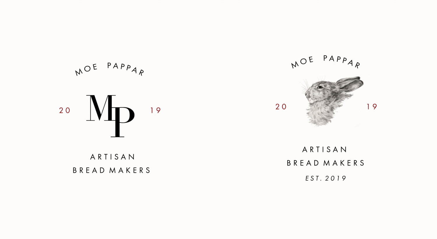
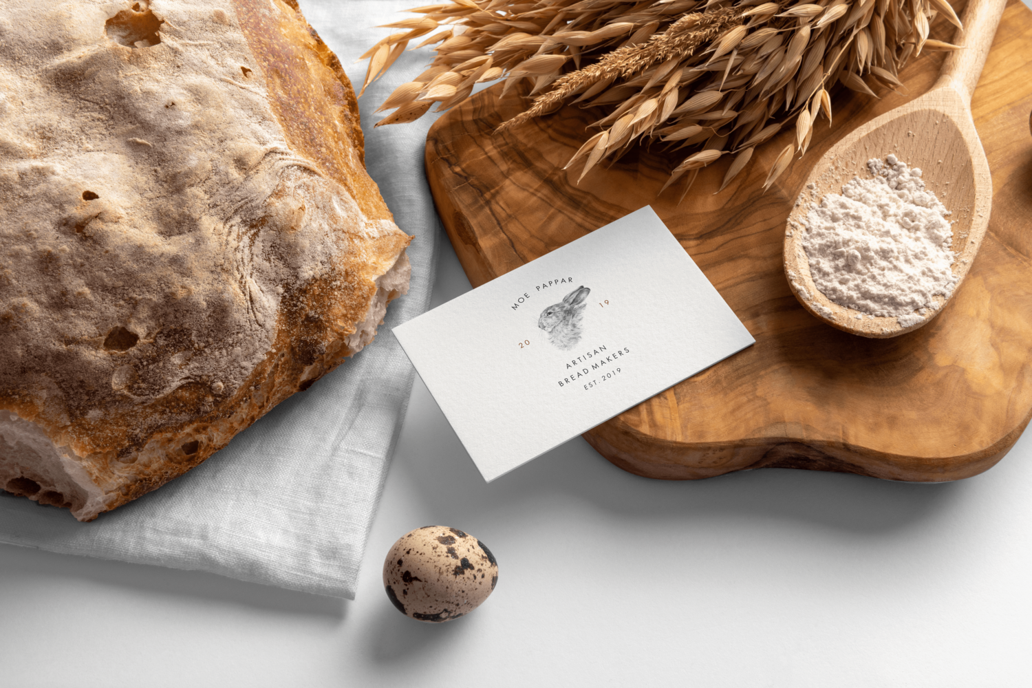
Moe Pappar is an Ohio-based artisanal bread company known for its rustic, small-batch loaves. I was brought on to refresh their brand identity and create packaging that reflects the handmade quality of their product. The scope included a primary and secondary logo, bread labels, and a custom illustrated paper wrap used for packaging loaves.
My Role
Lead designer and illustrator — responsible for the full visual refresh.
Developed a new primary wordmark and secondary logo
Designed bread labels with consistent typography and space for product variants
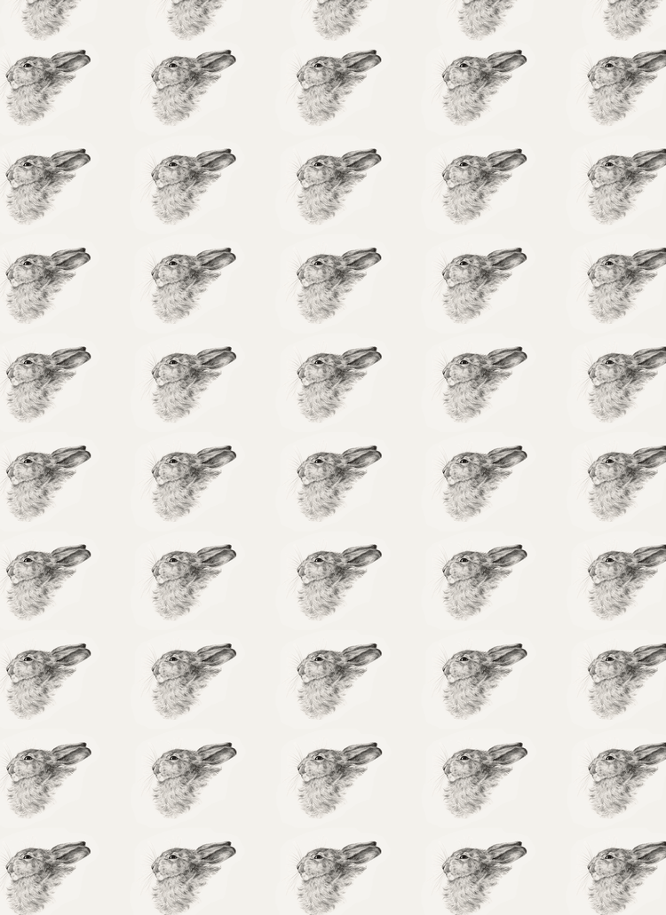
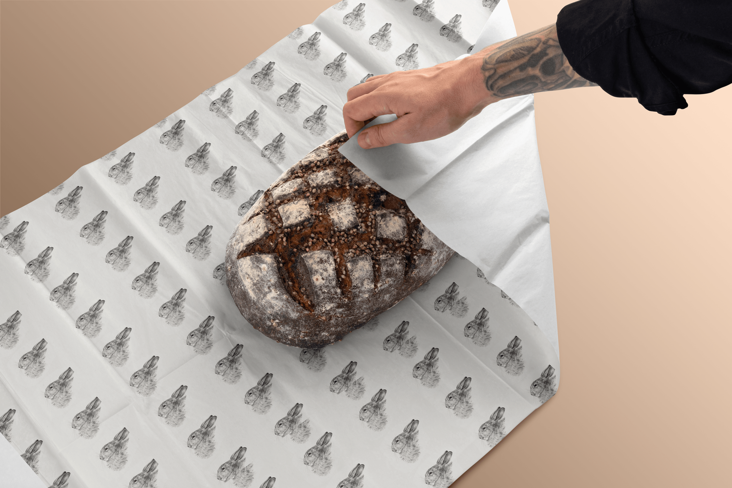
Illustrated a repeating pattern of rustic rabbits for the custom paper wrap
Prepped files for printing and ensured dielines were production-ready
The Challenge
The existing branding didn’t reflect the quality or story behind the bread. Labels were inconsistent and didn’t stand out on shelves, and the client wanted packaging that would give customers a “farm-to-table” experience.
Research & Moodboarding — Collected inspiration from heritage bakeries, European bread packaging, and rustic illustration styles.
Logo Exploration — Iterated on hand-drawn and vector-based logomarks to find the right balance between playful and premium.
Label System — Designed a flexible label template to accommodate multiple flavors and future products.
Illustrated Packaging — Created a repeating rabbit illustration that adds personality and elevates the unboxing experience.
Final Deliverables
Primary and secondary logo
Bread label system
Illustrated paper wrap
Business cards for owner and staff

Reflection
This project taught me how to balance playful illustration with a professional, scalable brand system. The final identity gives Moe Pappar a distinct presence on the shelf and builds a memorable brand experience for customers.